Tag Archives for " acrylic painting "

Weird Way How to Apply Gesso to Your Canvas
Most store-bought canvases are not primed very well and can benefit from another layer or two of gesso.
Introduction:
When it comes to preparing a canvas for painting, most artists stick to traditional methods. However, there’s an unconventional technique that can give you a smoother surface and enhance the detail in your work. In this tutorial, we’ll explore a unique way to apply gesso to your canvas using a drywall taping knife. This method not only helps in creating a finer texture but also saves you from extensive sanding later on. Let’s dive into this step-by-step guide.
The Tools You’ll Need:
Before starting, gather the necessary tools and materials. You’ll need:
- Gesso: The base primer for your canvas.
- Matte Medium: Helps to smooth out the gesso and make it more fluid.
- Drywall Taping Knife (6-inch): The star of this method for spreading the gesso evenly.
- Flat Edge Paintbrush: For initial application.
- Yogurt Container: To mix the gesso and matte medium.
- Gloves and Apron: To protect your hands and clothing.
Preparing the Gesso Mixture:
- Mixing the Gesso: Begin by pouring a small amount of gesso into a container—an empty yogurt cup works perfectly. Fill it about a quarter of the way.
- Adding Matte Medium: To ensure a smoother application, add a few squirts of matte medium into the gesso. This addition will make the mixture more fluid, helping it spread more easily across the canvas.
- Stirring: Use a palette knife to thoroughly mix the gesso and matte medium. Ensure the consistency is even, with no lumps or dry spots.
Applying the Gesso:
- Initial Application with a Brush: Dip your flat edge paintbrush into the gesso mixture, and apply it to the top left corner of your canvas. Brush downwards, covering the entire surface. Aim for a generous, even coat.
- Smoothing with the Drywall Taping Knife: After applying the gesso, grab your drywall taping knife. Starting at the top, use even pressure to smooth the gesso down the canvas. Work in long, continuous strokes to avoid leaving streaks or ridges.
- Feathering the Edges: As you work, you may notice ridges forming on the surface. To remove these, lightly graze the surface with the taping knife, using minimal pressure. This technique will help blend the gesso evenly across the canvas.
Troubleshooting Common Issues:
- Dealing with Ridges: If ridges persist, continue feathering them out with the knife. Adjust your pressure as needed, moving from firm to light strokes to achieve a smooth finish.
- Applying Additional Layers: If the first coat is too thin, allow it to dry and then apply a second coat using the same method. This additional layer can further enhance the smoothness of your canvas.
Final Touches:
After the gesso has dried, it’s time to inspect the canvas. Look for any remaining ridges or imperfections. If you find any, lightly sand the surface using a 250 or 300-grit sandpaper. This step will ensure an ultra-smooth finish, ready for painting.
Tips for Success:
- Work Quickly: Gesso can dry fast, especially in a warm environment. To prevent streaks, work swiftly when applying and smoothing the gesso.
- Use the Right Tools: While a larger drywall trowel can be used, a 6-inch taping knife offers better control and precision, especially on smaller canvases.
- Practice Makes Perfect: This technique may take some getting used to, but with practice, you’ll find it easier to achieve a smooth, professional-quality canvas.
Using a drywall taping knife to apply gesso might seem unusual, but it’s a powerful technique for artists seeking a smoother canvas surface. By following these steps, you can minimize brush strokes, reduce the need for sanding, and create a better foundation for your paintings.
Read more about my additional resources, tutorials, to learn more and check out my free courses here. . Whether you’re a beginner or an experienced artist, there’s always something new to learn and apply to your paintings. Happy painting!
- Sketching Your Painting Accurately
- Beginning a Pet Portrait in Acrylic
- The Mystery of Realism in Painting
- Apply A Burnt Sienna Glaze to a Portrait
- Learn How to Sketch a Portrait Freehand in 45 Minutes
- Adding highlights to your acrylic painting
- 5 Excellent Reasons to Use Aluminum Foil
- Paint Realistic Wrinkles in Acrylic
- Painting Clothing in an Acrylic Portrait
- Paint a Cloudy Sky Acrylic
- How to add Semi-Opaque Highlights
- How to Enhance the Contrast in Your Acrylic
- How to Add Glaze to Your Acrylic Painting
- Paint Realistic Reflections on Eyeglasses in an Acrylic Portrait
- Build Up Depth on Your Acrylic Portrait Backgrounds
- How Do You Do Layers With the Glazing Technique?
- Learn How to Paint Wrinkles in Acrylic
Read more about how to paint a portrait that you can surely be proud of!
I’d love to hear your thoughts on this video. Please share it with your friends and family. Let me know if you have any further questions. I’ll greatly help you.
If you’d like to learn more, sign up for my free email tips and video class today.
Learn How to Paint Acrylic Portraits With My Free Mini-Video Course!
Thank you so much for taking the time to read this tutorial and watch the video. That means a lot to me. I hope you find it very helpful in your portrait painting.
Yours for Better Portraits,

P.S. Did you find this post helpful or encouraging? If so, send it on ahead! Let others know with the share buttons below. I’d love to hear your comments. Thank you so much! Also, do you have a question on acrylic portrait painting you’d like answered? Let me know, and I’d be happy to help!

How to Shading & Skin Tones on Small Faces
Having trouble shading and toning small faces?
Introduction
When painting small faces in acrylic portraits, achieving the right balance of shading and skin tones can be tricky. The key lies in understanding light values and applying the glazing technique to create realistic tones and depth. In this post, I will guide you through a step-by-step process that will help you refine your acrylic portrait and improve your ability to paint smaller, more intricate details.
Step 1: Understanding Light Values
Before working with color, it’s essential to focus on values. Values refer to the lightness or darkness of an area, and they must be correctly identified and applied before considering color. For small faces, areas like the nose, chin, and cheeks are crucial for defining the facial structure. Often, light comes from above, casting subtle shadows and highlights that bring out the form.
- Tip: Use reference photos to study where light falls and shadows form on the subject’s face.
Step 2: Selecting Colors for Skin Tones
To achieve realistic skin tones, choose a mix of burnt sienna and titanium white as your base. Adding raw sienna or pyrrole orange can help create warmth and chromatic variation. Start with these hues and adjust the mix depending on the tone you want to achieve. For example, titanium white will cool the skin tone, making it lighter, while raw sienna adds warmth.
- Technique: Mix your colors with matte medium to create a transparent glaze that gives your painting more luminosity. Matte medium thins the paint while keeping it translucent, allowing for subtle layers of color that add depth without overwhelming the details.
Step 3: Applying Glazes for Smooth Shading
Glazing is crucial for achieving smooth transitions between light and shadow. When working on small faces, apply thin, semi-opaque glazes to slowly build up the skin tone. Make sure to adjust the transparency by adding more matte medium to control how much of the underlying paint shows through.
- Start with the lighter areas: Apply a semi-opaque layer to the nose and chin, which typically catch more light.
- Darken the cheeks: Using a slightly darker glaze, apply this color to the cheeks to create contrast with the highlighted areas.
- Tip: Wipe off excess paint to avoid streaks and ensure the glaze goes on smoothly. This prevents any harsh lines from forming, which could make the face appear less realistic.
Step 4: Enhancing Shadows for Depth
Once the basic skin tones are in place, it’s time to enhance the shadows, particularly around the eyes, jawline, and nose. Shadows are often underpainted, leading to faces that lack depth. When shading small faces, it’s vital to ensure that areas such as the eye sockets are sufficiently darkened to enhance realism.
- Tip: Don’t be afraid to go darker in these areas—shadows help ground the subject and bring the highlights into sharper focus.
Step 5: Adjusting Skin Tone with Chromatic Intensity
As you build up layers of glazes, add small amounts of pyrrole orange or Indian yellow to intensify the chroma. This helps achieve a more natural skin tone that has subtle color variations. Skin isn’t a flat color but rather a dynamic surface with slight shifts in hue.
- Technique: Add a little matte medium to each glaze to increase translucency, making the layers more vibrant and realistic. Apply the glaze lightly to areas like the neck or cheeks to enhance warmth, blending softly into the surrounding tones.
Step 6: Adding Final Shading and Highlights
To finish the shading process, concentrate on the jawline and neck area, particularly where light reflects off the subject’s clothing. For example, red clothing can reflect onto the neck, casting a warm glow. In such cases, mix pyrrole orange with matte medium and apply it sparingly to mimic this effect.
Finally, add a final layer of highlights using a lighter glaze of titanium white. These highlights should be carefully placed on areas like the tip of the nose or chin to emphasize light reflections and bring the painting to life.
Tips for Success:
- Keep your reference close: Position your reference photo close to your canvas or easel so you don’t lose focus on important details.
- Layer gradually: Acrylic painting is best done in layers. Don’t rush the process by applying too much paint at once.
- Use multiple glazes: Thin, multiple layers of glazes help achieve a smooth and realistic finish.
- Mix paints properly: Ensuring the correct mix of color and matte medium is crucial for achieving the right transparency.
- Adjust shadows properly: Eye sockets and other shadowed areas should be dark enough to provide contrast.
Shading and adjusting skin tones on small faces in an acrylic portrait can be accomplished through careful observation and the application of glazing techniques. Focus on values first, and build up skin tones through thin, transparent layers. By following these steps, you’ll improve the depth and realism in your portraits, making even the smallest details shine.
If you want to learn more about perfecting your acrylic portraits, download my free PDF guide, “Fix Muddy Skin Tones in Your Acrylic Portrait now.
- Sketching Your Painting Accurately
- Beginning a Pet Portrait in Acrylic
- The Mystery of Realism in Painting
- Apply A Burnt Sienna Glaze to a Portrait
- Learn How to Sketch a Portrait Freehand in 45 Minutes
- Adding highlights to your acrylic painting
- 5 Excellent Reasons to Use Aluminum Foil
- Paint Realistic Wrinkles in Acrylic
- Painting Clothing in an Acrylic Portrait
- Paint a Cloudy Sky Acrylic
- How to add Semi-Opaque Highlights
- How to Enhance the Contrast in Your Acrylic
- How to Add Glaze to Your Acrylic Painting
- Paint Realistic Reflections on Eyeglasses in an Acrylic Portrait
- Build Up Depth on Your Acrylic Portrait Backgrounds
- How Do You Do Layers With the Glazing Technique?
- Learn How to Paint Wrinkles in Acrylic
Read more about how to paint a portrait that you can surely be proud of!
I’d love to hear your thoughts on this video. Please share it with your friends and family. Let me know if you have any further questions. I’ll greatly help you.
If you’d like to learn more, sign up for my free email tips and video class today.
Learn How to Paint Acrylic Portraits With My Free Mini-Video Course!
Thank you so much for taking the time to read this tutorial and watch the video. That means a lot to me. I hope you find it very helpful in your portrait painting.
Yours for Better Portraits,
P.S. Did you find this post helpful or encouraging? If so, send it on ahead! Let others know with the share buttons below. I’d love to hear your comments. Thank you so much! Also, do you have a question on acrylic portrait painting you’d like answered? Let me know, and I’d be happy to help!

How to Block-in Dark Values on Chiaroscuro Acrylic
How to layer and blend acrylic paint for depth
When creating a chiaroscuro painting, one of the most critical steps is blocking in the dark values. This technique emphasizes the contrast between light and dark, producing dramatic lighting and depth. In this guide, you’ll learn the steps to apply dark tones strategically using acrylics, helping you to achieve a balanced and realistic portrayal. By following along, you’ll understand the key methods for effectively handling dark values to improve your paintings.
Materials and Paint Mixtures for Blocking-In
Before diving into the process, it’s important to prepare the correct materials. In this tutorial, we’ll be using a mix of raw umber dark, ultramarine blue, and burnt sienna. The combination of these colors allows for the creation of rich, dark tones. When mixed together, these shades form the ideal hues for blocking in the shadows that define the chiaroscuro technique.
Make sure to have these materials ready:
- Raw Umber Dark
- Ultramarine Blue
- Burnt Sienna
- Alizarine Crimson (optional for richness)
- Flat Brushes in Various Sizes
- Matte Medium
Step 1: Preparing the Dark Values
To begin with, mix raw umber dark and ultramarine blue on your palette, aiming for a deep and cool-toned black. Add a touch of burnt sienna to warm up the mixture slightly. This blend serves as the base for your dark values.
Tip:
For added richness, you can include a hint of alizarine crimson. This will introduce subtle depth to your shadows, making them more visually dynamic.
Once your color is mixed, load your brush and ensure you have enough paint to cover large sections of the painting.
Step 2: Blocking in the Shadows
Start by using a larger flat brush to block in the darkest areas of your subject. These shadows define the structure of your composition and help establish the dramatic lighting that is key to chiaroscuro. Use a bold, confident stroke to apply the dark paint, particularly in the background areas or where the deepest shadows fall.
Technique Tip:
Apply the paint in diagonal strokes for a smoother finish. As acrylic dries quickly, you’ll need to blend while the paint is still wet. Thin the paint with matte medium if needed to increase translucency, ensuring smoother transitions between values.
Step 3: Cutting Around the Edges
When working around detailed parts of the painting, such as the subject’s clothing or hair, switch to a smaller brush for precision. Carefully “cut” around these areas, making sure the dark values don’t intrude on the lighter portions of the painting.
This step is crucial for maintaining the balance between hard and soft edges, which enhances the realism of your artwork.
Technique Tip:
Leave a slight gap where highlights will go later. This will help prevent overlapping, which can muddy the dark tones. If you make a mistake, don’t worry—you can fix it with additional layers later.
Step 4: Balancing Opacity and Transparency
As you apply the dark paint, consider how opaque or translucent you want the layer to be. More opaque paint will create stronger contrasts, while translucent layers help smooth out transitions. Then, gradually build up to a fully opaque black background or shadow as you work.
Technique Tip:
If your paint dries unevenly or too quickly, but you use a perpendicular brush stroke to avoid digging into the surface. When you hold the brush lightly and ease the pressure as you near the top of the stroke, creating a smooth, seamless gradient.
Step 5: Smoothing Out the Dark Layers
Once you’ve blocked in the major dark areas, take time to smooth out any rough patches. Use a soft, diagonal stroke to blend between different tones. Work from dark to light, gradually using less paint as you move into the lighter areas of the painting. This smooth transition is essential for maintaining the realistic feel of chiaroscuro.
Technique Tip:
If areas become choppy or uneven, apply another layer of paint. To avoid this, maintain consistent brush pressure and direction.
Step 6: Enhancing the Richness of Shadows
To add more depth to your painting, apply additional layers of dark values where needed. For example, you might deepen the shadows on fabric folds or darken areas behind your subject. A careful balance of hard edges and soft transitions will bring out the three-dimensionality of your work.
Incorporating subtle shifts between cooler and warmer dark tones—achieved by adjusting your mix with ultramarine blue or burnt sienna—further enhances the richness of the shadows.
Achieving Contrast in Chiaroscuro Painting
Blocking in dark values is a vital component of creating a successful chiaroscuro painting. Then, by using a balanced mixture of raw umber dark, ultramarine blue, and burnt sienna, and applying it with precision and confidence, you can build the dramatic contrast needed for a striking and realistic result. Also, always, remember to carefully blend your strokes, maintain a balance between soft and hard edges, and layer your paint for added depth.
With practice, these techniques will help you master chiaroscuro acrylic painting, giving your portraits a sense of realism and intensity that captivates viewers.
Read more about my additional resources, tutorials, to learn more and check out my free courses here. . Whether you’re a beginner or an experienced artist, there’s always something new to learn and apply to your paintings. Happy painting!
- Sketching Your Painting Accurately
- Beginning a Pet Portrait in Acrylic
- The Mystery of Realism in Painting
- Apply A Burnt Sienna Glaze to a Portrait
- Learn How to Sketch a Portrait Freehand in 45 Minutes
- Adding highlights to your acrylic painting
- 5 Excellent Reasons to Use Aluminum Foil
- Paint Realistic Wrinkles in Acrylic
- Painting Clothing in an Acrylic Portrait
- Paint a Cloudy Sky Acrylic
- How to add Semi-Opaque Highlights
- How to Enhance the Contrast in Your Acrylic
- How to Add Glaze to Your Acrylic Painting
- Paint Realistic Reflections on Eyeglasses in an Acrylic Portrait
- Build Up Depth on Your Acrylic Portrait Backgrounds
- How Do You Do Layers With the Glazing Technique?
- Learn How to Paint Wrinkles in Acrylic
Read more about how to paint a portrait that you can surely be proud of!
I’d love to hear your thoughts on this video. Please share it with your friends and family. Let me know if you have any further questions. I’ll greatly help you.
If you’d like to learn more, sign up for my free email tips and video class today.
Learn How to Paint Acrylic Portraits With My Free Mini-Video Course!
Thank you so much for taking the time to read this tutorial and watch the video. That means a lot to me. I hope you find it very helpful in your portrait painting.
Yours for Better Portraits,
P.S. Did you find this post helpful or encouraging? If so, send it on ahead! Let others know with the share buttons below. I’d love to hear your comments. Thank you so much! Also, do you have a question on acrylic portrait painting you’d like answered? Let me know, and I’d be happy to help!

Matte Medium vs. Gloss Medium for Acrylic Glazing
Students who are new to my glazing technique have a lot of questions. So many mediums to choose from. Which ones are best to use…and why?
That’s what I want to discuss today.
Here’s a portion of an email I got from one of my students:
As you know, I am currently working on your portrait course at the moment, however, I have a question that I hope you can clarify. All previous information I have looked up indicates that when applying glazes, acrylic matte medium dries cloudy and gloss medium dries clear and obviously glossy. Can you just explain it for me why we only use matte medium for glazing in your tutorial, as my initial thoughts would be that the cloudiness would just build up? Or am I just missing the l point in that this is how we build up the underpainting of the portrait? Many Thanks, R—
This is a good question.
So, what’s better for glazing? Matte medium or gloss medium?
Let me answer that with the reply I sent back to my student.
I use matte medium for three reasons:
1. It dries to a flat finish and so it doesn’t react with the lights in my studio, producing distracting glare.
2. Because it dries to a flat finish, it is closer to the sheen of paint, and so when you have areas that are more opaque and less opaque, they match up better. In other words, you can perceive the values more accurately. A glossy finish will make colors look more saturated and deepen values. When you put a varnish over the painting, it would present a problem, causing certain subtle nuances that seemed to look correct, suddenly become inaccurate. (Yes, this happened to me!)
3. Matte medium is usually less expensive than gloss medium. With the copious amounts of medium that I use, this adds up!
Now, I don’t find that matte medium builds up cloudiness, in the way that I teach. It will get cloudy, if you have areas of your painting that are quite dark or saturated, and you overlap those areas with a very transparent (high ratio of matte medium to paint) glaze.
But I don’t do it that way in my paintings. Rather, I start off very transparent, (95-5) then shift to more translucent (80-20), and finally end up with semi-opaque layers (50-50) over portions of the work.
Acrylic portrait painting challenge example in progressm using the acrylic glazing technique, 16 x 20, acrylic on canvas by artist and instructor Matt Philleo
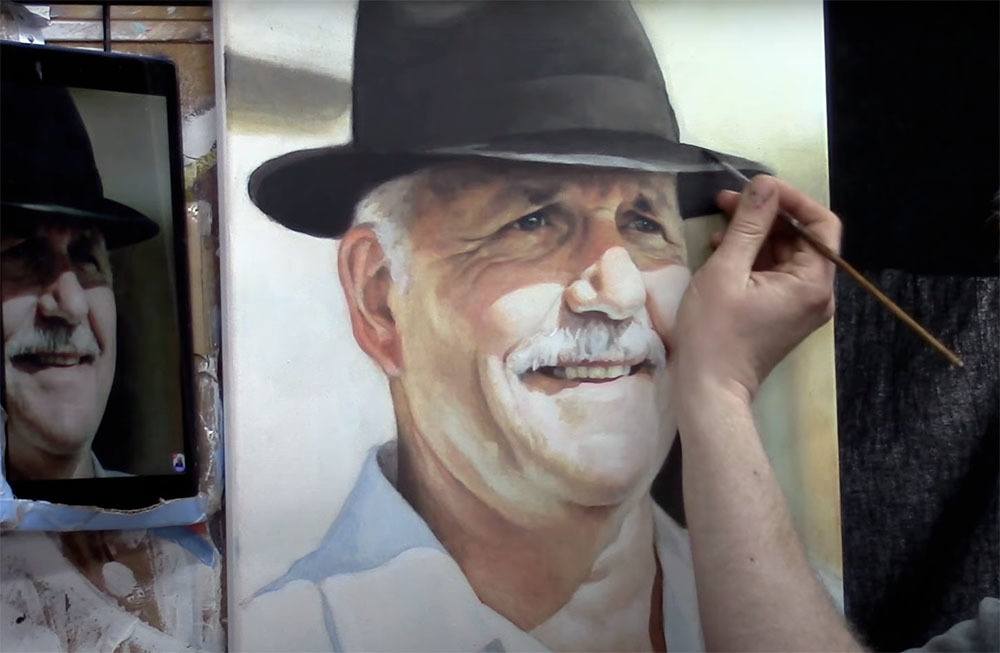
Matt Philleo painting an acrylic portrait from a photo for the Spring Portrait Painting Challenge ©2020 by Matt Philleo
This prevents that cloudiness from occurring and gives a rich saturation of color too. But we still retain the benefits of the smooth shading, vibrancy, and depth that glazing produces.
I finish my painting with a satin or semi-gloss varnish and that’s where we can add some extra saturation of value and vibrancy.
What is YOUR experience with acrylic mediums? Which do you prefer…and why? Let me know in the comments below.
Look forward to sharing more tips and tutorials with you.
Yours for Better Portraits,
![]()
If you found this post helpful or encouraging, would you send it on ahead? Let others know with the share buttons below. I’d love to hear your comments. Thank you so much!

How to Improve Your Painting with 3 Different Light Sources
Enhance realism in your portrait with three essential light sources
Lighting plays a crucial role in bringing life, depth, and realism to any painting. In this tutorial, we’ll explore three distinct types of light sources—primary, secondary, and reflected—and how understanding their influence can significantly elevate your artwork. By applying these techniques, your acrylic paintings will achieve greater dimensionality and accuracy.
The Importance of Light in Painting
Light is more than just a means of illumination in painting; it’s a fundamental aspect that shapes the entire composition. By controlling how light interacts with your subject, you guide the viewer’s eye, evoke mood, and provide depth. In this guide, we will break down how to use three key light sources: the primary light, secondary light, and reflected light. Understanding and incorporating these elements will improve your shading and realism.
1. Primary Light Source: The Foundation of Your Shading
What is the Primary Light Source?
The primary light source is the strongest and brightest light source in your composition. It typically represents sunlight or indoor lighting and dictates the overall direction of your shadows. Its intensity and position influence the most pronounced highlights and shadows in your painting.
For instance, in my painting depicting Acts Chapter 3, where Peter and John raise a lame man through the power of Christ, the early morning sunlight acts as the primary light source. The sunlight strikes the subject’s face from a low angle, illuminating the upper lip, the folds of the clothing, and parts of the hands.
Tips for Utilizing the Primary Light Source:
- Observe Carefully: Always determine where your light is coming from and maintain consistency throughout the painting.
- Highlighting Areas: Focus on the parts that receive the most light. In the case of early morning or late afternoon sunlight, lower parts of the face and body may catch more light than expected.
- Adjust Your Shadows: The placement of shadows is just as important as light. Always cross-check your reference photo to make sure your shadows are aligned with the direction of your light source.
2. Secondary Light Source: The Ambient Glow
What is the Secondary Light Source?
The secondary light source often comes from the surrounding environment, such as the sky, and casts a softer, more diffuse light on the subject. In outdoor scenes, this source is often the sky itself, reflecting a bluish hue, particularly on white or light-colored surfaces. In our example, the man’s white clothing catches the blue light from the sky, creating a cooler tone in areas not directly lit by the sun.
Techniques for Working with Secondary Light:
- Identify Sky Reflections: In outdoor paintings, observe how the sky’s light reflects on surfaces. White clothing or reflective surfaces, like water, will often take on a blue tint, especially in shadowed areas.
- Balance Between Light and Shadow: Secondary light softens the harshness of shadows, so areas that aren’t in the direct path of your primary light will still be illuminated subtly by this ambient light.
- Use Cooler Tones: For realism, incorporate cool tones like blue or gray into your shadows, depending on the light conditions.
3. Reflected Light: Adding Warmth and Depth
What is Reflected Light?
Reflected light is light that bounces off nearby surfaces and illuminates the subject indirectly. This light is typically softer and more diffuse but can drastically affect the realism of your painting. It often carries the color of the surface it reflects off, adding warmth or coolness to your shadows and shaded areas. In the example painting, reflected light is noticeable in areas like the underside of the subject’s clothing folds. The light bouncing off nearby fabric creates a warm reflection, adding a soft glow to areas that would otherwise be in deep shadow.
Techniques for Enhancing Reflected Light:
- Observe Reflections: Pay attention to the surfaces around your subject. If the surroundings are warm, like red earth or yellow walls, the reflected light will also have warm tones. Conversely, cooler surfaces will result in cooler reflected light.
- Subtle Shading: Use lighter and warmer hues to depict areas affected by reflected light. This will prevent your shadows from appearing too flat or dark.
- Layer Colors: Build up your reflected light in layers to gradually introduce warmth. For example, in fabric folds or near reflective surfaces, layer warm tones like burnt sienna or yellow ochre to create soft light effects.
Transitioning Between Light Sources
Transitioning between these light sources can be seamless if done correctly. Begin by establishing your primary light source and its direct effects on the subject. Next, incorporate secondary light by softly blending cooler tones into areas of shadow. Lastly, add reflected light in strategic places to provide warmth and realism, particularly in areas where the primary and secondary light sources don’t reach.
For example, you might use a glaze of blue over shadowed areas of clothing to represent the secondary light source, then add a touch of warm, reflected light where appropriate. By working gradually and layering your glazes, you’ll create smoother transitions and enhance the depth in your painting.
Common Mistakes to Avoid
- Inconsistent Light Sources: Always ensure that the direction and intensity of your light sources are consistent throughout the painting. If one side of the face is illuminated by the primary light, the shadows should align accordingly.
- Overly Harsh Shadows: While shadows are important for creating depth, overly dark or hard-edged shadows can make a painting look unnatural. Soften them with secondary and reflected light.
- Ignoring Reflected Light: This light source can add a lot of life and dimension to your painting. Don’t overlook areas that could benefit from subtle reflected light, like the undersides of objects or folds in clothing.
Elevate Your Painting with Light Mastery
By understanding and employing these three light sources—primary, secondary, and reflected light—you can bring more realism and depth into your painting. Whether you’re working on portraits, landscapes, or still life, mastering the nuances of light will take your artwork to the next level.
Practice observing light in the world around you and apply these principles to your paintings. Before long, you’ll see noticeable improvements in the depth, realism, and overall impact of your work.
Read more about my additional resources, tutorials, to learn more and check out my free courses here. . Whether you’re a beginner or an experienced artist, there’s always something new to learn and apply to your paintings. Happy painting!
3 Light Sources to Improve Your Painting
LEARN MORE
- How to Paint Foliage Using the Acrylic Glazing Technique
- How to Trace for an Accurate Portrait Sketch
- How to Paint Realistic Eyes in Your Acrylic Portrait
- How to Add Raw Umber Dark & Ultramarine Blue to Your Portrait
- How to Make Your Own Raw Umber Dark
- How to Paint Realistic Trees & Grass in Your Acrylic
- How to Block In Skin Tone Values Using Glazing Technique
- How to Paint Vibrant Reds in Your Acrylic Portrait
- How to Glaze Background Colors & More Acrylic Portrait
- How to Paint White Clothing in Your Acrylic Portrait
- How to Easily Transition from a Sketch to a Painting
- How to Block In Shading & Skin Tones in Your Acrylic
- How to Build Up Color on Acrylic Pet Portrait
- How to Build Up Form on Clothing with Acrylic
- How to Paint Dark Clothing Using Acrylic Glazing Technique
- How to Paint a 24 x 30 Acrylic With 30 People
- How to Do Smooth Shading with Acrylic
- How to Sketch an Acrylic Portrait with a Grid
Read more about how to paint a portrait that you can surely be proud of!
I’d love to hear your thoughts on this video. Please share it with your friends and family. Let me know if you have any further questions. I’ll greatly help you.
If you’d like to learn more, sign up for my free email tips and video class today.
Learn How to Paint Acrylic Portraits With My Free Mini-Video Course!
Thank you so much for taking the time to read this tutorial and watch the video. That means a lot to me. I hope you find it very helpful in your portrait painting.
Yours for Better Portraits,
P.S. Did you find this post helpful or encouraging? If so, send it on ahead! Let others know with the share buttons below. I’d love to hear your comments. Thank you so much! Also, do you have a question on acrylic portrait painting you’d like answered? Let me know, and I’d be happy to help!

How to Remarque your Canvas in Print
Elevating your canvas prints with hand-painted details
Remarque prints allow artists to enhance the beauty of their canvas prints by adding personal, hand-painted details. These added elements create unique, one-of-a-kind pieces of art that surpass the standard reproduction process. In this tutorial, we will explore the step-by-step process of how to remarque your canvas in print, adding contrast, vibrancy, and personal touches to make them stand out as individual works of art.
Understanding the Remarque Process
Remarque is a technique where artists add hand-painted elements on top of a printed canvas, enhancing the piece by restoring contrast and vibrancy that may have been lost during the reproduction process. It allows artists to give each print a unique flair, turning it into its own distinct artwork.
In this example, we will focus on adding highlights, shadows, and color nuances to a limited-edition canvas print, giving it a more detailed, personalized finish.
Step-by-Step Guide to Remarquing Your Canvas
- Gather Your Supplies: Before you begin, make sure you have the following materials:
- A high-quality canvas print. A range of acrylic paints (raw umber dark, burnt sienna, ultramarine blue, titanium white, indian yellow, etc.). Satin or matte acrylic medium for blending and sheen matching. A palette and brushes suitable for fine details.
- Analyze the Print: Take a close look at your canvas print. In this tutorial, the artist used a smaller version of the print as a reference to guide the restoration of contrast and brightness. Identifying areas that need enhancement is critical to avoid overpainting or disrupting the overall design. Focus on restoring parts that lost vibrancy, such as facial features, highlights, and shadows.
- Prepare Your Palette: Mix your paints carefully to match the existing colors on the print. In the video, a mixture of white and yellow (specifically indian yellow) was used to add brightness. Keep the colors thin by adding medium, ensuring that the layers will blend seamlessly into the original print.
- Begin Adding Details: Start with small, subtle enhancements. In the video, the artist began by restoring highlights on the subject’s face, focusing on areas such as the eye, nose, and hand. These subtle additions help create depth and vibrancy without overpowering the original print.
- Tip: Use a thinned-down mixture of paint and medium to avoid stark contrasts. Feather the paint onto the canvas lightly to blend it into the surrounding areas.
- Restore Contrast: One of the key aspects of remarques is restoring contrast that may have been lost during the printing process. Focus on areas where shadows and highlights should be more pronounced. For instance, in the video, the artist added highlights to the subject’s face, hand, and clothing to bring back the depth of light and shadow.
- Enhancing Small Elements: Pay attention to minor details like reflections and highlights. In the tutorial, the artist added small touches to the subject’s eye and flame in a lamp to make them pop. These tiny details, though subtle, make a significant difference in the overall appearance of the canvas.
- Match the Sheen of the Canvas: To ensure your painted details blend with the printed surface, use a satin medium. Because this will match the sheen of the print, ensuring that your brushstrokes don’t stand out as overly glossy or dull. Then I used a mix of gloss and satin mediums to achieve the right finish.
- Final Touches: Once the major areas have been enhanced, step back and observe the canvas from a distance. Look for any areas that may need additional touch-ups, such as the flame, clothing, or background elements. So, I brightened the flame in the lamp and added luminosity to parts of the subject’s clothing to give the canvas a more vibrant look.
- Tip: Then, use very light, feathery strokes for small adjustments. In the video, I used short strokes in different directions to achieve a smooth blend.
Why Remarque Your Canvas?
Remarque prints offer several benefits for both artists and collectors:
- Enhanced Value: By adding personal, hand-painted details, you increase the value of each print. Because, these custom additions make each piece unique, appealing to art collectors looking for something special.
- Increased Vibrancy and Contrast: Printing can sometimes reduce the contrast and brightness of the original painting. Remarquing allows you to restore those elements, making the piece more vibrant and engaging.
- Personal Artistic Touch: Remarquing lets artists revisit their work and add new artistic flair. This process makes each print feel more like an original, personalized artwork.
Tips for Successful Remarquing
- Start Small: Begin with subtle changes before moving on to more dramatic adjustments. This approach helps ensure that you don’t overdo it.
- Use the Right Medium: So, always match the sheen of the printed canvas with the right medium. In most cases, a satin or matte medium works best to avoid an overly glossy or mismatched finish.
- Feather Your Strokes: To blend hand-painted details with the existing print, use light, feathery strokes. Thinned-out paint will also help you achieve a more natural look.
- Monitor Progress: Regularly step back from your work to assess your progress from a distance. This helps you see the overall impact of your additions.
Remarquing a canvas print then allows you to add your personal touch to each piece, transforming a reproduction into a unique work of art. Then, by carefully adding highlights, shadows, and fine details, you can elevate your canvas prints and offer something special to collectors. Whether you’re an artist looking to personalize your prints or an art collector seeking a more vibrant piece, remarques provide an excellent way to enhance canvas prints.
By following the steps in this guide, you can confidently begin adding your own artistic flair to your canvas prints, turning each one into a truly unique masterpiece.
- How to Paint Foliage Using the Acrylic Glazing Technique
- How to Trace for an Accurate Portrait Sketch
- How to Paint Realistic Eyes in Your Acrylic Portrait
- How to Add Raw Umber Dark & Ultramarine Blue to Your Portrait
- How to Make Your Own Raw Umber Dark
- How to Paint Realistic Trees & Grass in Your Acrylic
- How to Block In Skin Tone Values Using Glazing Technique
- How to Paint Vibrant Reds in Your Acrylic Portrait
- How to Glaze Background Colors & More Acrylic Portrait
- How to Paint White Clothing in Your Acrylic Portrait
- How to Easily Transition from a Sketch to a Painting
- How to Block In Shading & Skin Tones in Your Acrylic
- How to Build Up Color on Acrylic Pet Portrait
- How to Build Up Form on Clothing with Acrylic
- How to Paint Dark Clothing Using Acrylic Glazing Technique
- How to Paint a 24 x 30 Acrylic With 30 People
- How to Do Smooth Shading with Acrylic
- How to Sketch an Acrylic Portrait with a Grid
Read more about how to paint a portrait that you can surely be proud of!
I’d love to hear your thoughts on this video. Please share it with your friends and family. Let me know if you have any further questions. I’ll greatly help you.
If you’d like to learn more, sign up for my free email tips and video class today.
Learn How to Paint Acrylic Portraits With My Free Mini-Video Course!
Thank you so much for taking the time to read this tutorial and watch the video. That means a lot to me. I hope you find it very helpful in your portrait painting.
Yours for Better Portraits,
P.S. Did you find this post helpful or encouraging? If so, send it on ahead! Let others know with the share buttons below. I’d love to hear your comments. Thank you so much! Also, do you have a question on acrylic portrait painting you’d like answered? Let me know, and I’d be happy to help!

How to Apply Burnt Sienna Glaze to a Portrait
Creating depth and warmth with burnt sienna glazes step by step guide
Applying glazes to an acrylic portrait is a great way to add depth and unify the different elements of your painting. One versatile color used by many artists for this purpose is burnt sienna. This reddish-brown hue can bring warmth to shadowed areas and smooth transitions between light and dark, creating a cohesive, harmonious effect across your portrait. In this tutorial, you’ll learn how to apply a burnt sienna glaze step-by-step, ensuring your painting achieves a professional and balanced look.
What You Will Need
- Acrylic paints: Burnt sienna, raw umber dark, ultramarine blue
- Glazing medium
- 3/4-inch flat brush
- Small round brush for details
- Palette for mixing
- A well-textured canvas
Step 1: Preparing the Surface
Before applying the burnt sienna glaze, ensure that your portrait has established base layers with underlying shadows and highlights. In this example, I have already blocked in key elements using raw umber dark and ultramarine blue to define shadows and add depth. These layers are essential for giving the burnt sienna glaze something to interact with, creating richer tones and a natural flow of colors.
Step 2: Mixing the Burnt Sienna Glaze
Start by placing a small amount of burnt sienna on your palette. Mix it with a glazing medium until it reaches a smooth, transparent consistency. It’s important to blend it thoroughly, similar to mixing ingredients when baking a cake. The medium will help thin out the paint, allowing it to create a subtle wash of color over the portrait without losing the underlying details.
Step 3: Applying the Glaze to the Background
Begin with the background of your portrait. Dip the corner of your flat brush into the glaze mixture and apply it with even, horizontal strokes. As you work across the canvas, maintain a wet edge by moving quickly. Use firm pressure initially to push the paint into the texture of the canvas, and then lighten the pressure as you spread the glaze.
Tip: Turn your brush over to use any extra paint on the reverse side for a more efficient application. Lighten the pressure at the edges to smooth out any overlapping brushstrokes, giving your background a seamless transition.
Step 4: Integrating Burnt Sienna into the Portrait
Now that the background has been glazed, consider introducing burnt sienna into the shadows of the portrait, such as the hair, hands, and facial features. This reddish-brown hue adds warmth and depth to the shaded areas, making them stand out more vividly against the lighter tones.
For the hair, apply the glaze in the darker regions, blending it down towards the chin and neck. If you see this tone occurring naturally in the shadowed areas of the face, lightly glaze over these regions. Always make sure to evaluate where the burnt sienna fits best, as it’s a warm color that may not be suitable for cooler-toned areas like clothing.
Tip: When applying glaze to intricate areas such as hair, use a small round brush to control the precision of the strokes. This ensures the glaze enhances the features without overwhelming them.
Step 5: Enhancing Details with Glaze
A burnt sienna glaze can also enhance smaller details, like the fur of an animal in your portrait or the eyelashes. In this example, the artist finds that the glaze works beautifully within the dog’s fur, adding a touch of warmth. Similarly, in the boy’s facial features, it can accentuate the lips, eyebrows, and even parts of the gums and teeth.
When adding glaze to fine details, switch to a small round brush for more accuracy. This will help you control the flow of paint, allowing you to create more nuanced transitions between light and dark areas.
Step 6: Building Layers for Richer Color
Glazing is a technique that benefits from multiple layers. Once your first layer of burnt sienna glaze is dry, you can assess whether additional layers are needed to achieve your desired effect. Applying thin glazes in layers helps you avoid overloading the painting with too much color at once.
Technique Tip: In areas where the value is already dark, like deep shadows, it’s possible to introduce burnt sienna even further. The artist notes that darker areas can handle more layers because the color builds up gradually without overwhelming the overall tone.
Conversely, for lighter areas, avoid too much glazing as it could darken the value and obscure the highlights.
Step 7: Avoid Overglazing in Cooler Tones
One key consideration when using a warm tone like burnt sienna is to avoid applying it over cooler-toned areas of your portrait. For instance, the boy’s shirt in this example has a cooler undertone. While a small amount of burnt sienna may work in the darker parts of the shirt, applying too much can disturb the cooler color harmony.
Tip: Always take a step back from your portrait to evaluate the overall color balance. Introduce burnt sienna only where it naturally complements the existing colors.
Step 8: Final Touches
Once you’ve applied the burnt sienna glaze to all the necessary areas, assess the overall unity of the portrait. Burnt sienna can be an excellent way to tie together different elements of your painting. The artist uses it subtly within the lips, the dog’s fur, and parts of the background to create a consistent, warm feel throughout the composition.
Before moving on to the next stages of your painting, let the glaze dry fully. Once dry, you can continue building up layers, adding more glazes or opaque colors as needed to refine the portrait.
Tips for Applying Burnt Sienna Glaze:
- Use a Glazing Medium: This ensures that the paint remains translucent and allows the underlying layers to shine through.
- Keep a Wet Edge: Work quickly and maintain a wet edge while applying the glaze to avoid harsh lines.
- Layer Gradually: Apply multiple thin layers of glaze to control the intensity of the color.
- Avoid Cooler Areas: Use burnt sienna only in warm-toned areas of the painting to maintain color harmony.
- Use Different Brushes: For large areas, a flat brush is ideal. For small details, switch to a round brush for precision.
Tips
Applying a burnt sienna glaze to your portrait can enhance the warmth and depth of your artwork. It’s a versatile color that works well in shadowed areas and ties together various elements in your painting, creating a cohesive, professional finish. By following these steps and tips, you’ll be able to master this glazing technique and take your acrylic portraits to the next level.
- How to Paint Foliage Using the Acrylic Glazing Technique
- How to Trace for an Accurate Portrait Sketch
- How to Paint Realistic Eyes in Your Acrylic Portrait
- How to Add Raw Umber Dark & Ultramarine Blue to Your Portrait
- How to Make Your Own Raw Umber Dark
- How to Paint Realistic Trees & Grass in Your Acrylic
- How to Block In Skin Tone Values Using Glazing Technique
- How to Paint Vibrant Reds in Your Acrylic Portrait
- How to Glaze Background Colors & More Acrylic Portrait
- How to Paint White Clothing in Your Acrylic Portrait
- How to Easily Transition from a Sketch to a Painting
- How to Block In Shading & Skin Tones in Your Acrylic
- How to Build Up Color on Acrylic Pet Portrait
- How to Build Up Form on Clothing with Acrylic
- How to Paint Dark Clothing Using Acrylic Glazing Technique
- How to Paint a 24 x 30 Acrylic With 30 People
- How to Do Smooth Shading with Acrylic
- How to Sketch an Acrylic Portrait with a Grid
Read more about how to paint a portrait that you can surely be proud of!
I’d love to hear your thoughts on this video. Please share it with your friends and family. Let me know if you have any further questions. I’ll greatly help you.
If you’d like to learn more, sign up for my free email tips and video class today.
Learn How to Paint Acrylic Portraits With My Free Mini-Video Course!
Thank you so much for taking the time to read this tutorial and watch the video. That means a lot to me. I hope you find it very helpful in your portrait painting.
Yours for Better Portraits,
P.S. Did you find this post helpful or encouraging? If so, send it on ahead! Let others know with the share buttons below. I’d love to hear your comments. Thank you so much! Also, do you have a question on acrylic portrait painting you’d like answered? Let me know, and I’d be happy to help!

How to Paint Realistic Wrinkles in Acrylic
Learn to paint wrinkles in acrylic: step-by-step techniques for realistic textures
Painting realistic wrinkles in acrylic can be a challenging task, but with the right techniques, you can achieve lifelike textures and depth. In this tutorial, we will guide you through the process using proven methods like the glazing technique. This approach allows you to layer thin washes of color for dynamic shading and realistic detail.
Why Focus on Wrinkles?
Wrinkles are essential when painting portraits or clothing. They give the painting character, texture, and realism. Properly rendered wrinkles convey depth, shadows, and the contours of light, all of which contribute to a three-dimensional look on a two-dimensional surface. Understanding how light interacts with fabric and skin helps you create more accurate portrayals.
Materials You’ll Need
- Acrylic paints (Burnt Sienna, Raw Umber Dark, Titanium White, Ultramarine Blue, Phthalo Blue, Alizarine Crimson)
- Matte medium (for glazing)
- Small round brush (sizes 8 or 10)
- Reference photo (for lighting and contouring)
- Canvas or painting surface
Step-by-Step Guide to Painting Wrinkles
1. Starting with the Light Source
Before diving into the wrinkles, it’s crucial to understand where the light source is coming from. In this example, the light hits from the left-hand side, illuminating the subject’s jacket and face. Always start by identifying your light source, as it will guide the placement of highlights and shadows.
2. Sketch the Wrinkles
Begin by lightly sketching the contours of the wrinkles. Use a reference photo to guide your proportions and direction. Wrinkles often form around natural bends and folds of the fabric or skin, so pay attention to the areas where the material gathers or creases.
3. Layering with the Glazing Technique
The glazing technique is ideal for building realistic depth. To glaze:
- Mix acrylic paint with matte medium until it’s translucent.
- Apply thin, transparent layers of paint, allowing each layer to dry before adding the next. This method enhances the luminosity of your painting while preserving the details underneath.
In this painting, I darkened the background using a glaze of burnt sienna, raw umber dark, and titanium white. This combination helps the face and jacket stand out, creating contrast between the subject and background.
4. Adjusting the Proportions
As you progress, continue refining the details. For instance, the artist noticed the subject’s chin was too long, so they shortened it by applying burnt sienna, adjusting the shadow beneath the chin. This minor correction brings more balance to the composition.
5. Shading the Wrinkles
To achieve realistic shading:
- Use darker tones like raw umber and burnt sienna for the shadows.
- Gradually build up the shadows with thin glazes, following the natural folds and creases in the reference photo.
- A mixture of burnt sienna and titanium white is ideal for adding subtle gradations to the shadows under the chin and on the jacket.
Wrinkles often have a gradient effect, transitioning from light to dark as they curve away from the light source.
6. Highlighting the Creases
Once you’ve established the shadows, begin adding highlights. The wrinkles’ raised edges catch more light, so use lighter tones, such as a mix of titanium white and your base color, to accentuate these areas. By carefully applying highlights along the creases, you give the wrinkles a more three-dimensional appearance.
7. Adding Detail with a Small Brush
For intricate details, like smaller wrinkles or folds in the fabric, switch to a smaller brush (size 8 or 10). Dab a small amount of paint and blend with your finger or a dry brush for smooth transitions. The artist in this tutorial used this technique to soften and refine the shading on the nasolabial fold, giving it a natural, gradual fade.
8. Working on the Jacket’s Texture
The jacket requires a different approach to maintain its texture while capturing the depth of the wrinkles:
- Darken areas like the jacket sleeve or shoulder using a glaze of ultramarine blue, phthalo blue, and a touch of raw umber dark.
- Lighten certain folds by removing some of the glaze to reveal the underlying highlights.
This combination of dark and light glazes enhances the fabric’s texture and makes the wrinkles more realistic.
9. Final Touches
Once you have the basic structure of the wrinkles and shading in place, assess the overall composition. Look for any areas that might need more contrast or subtle details:
- Darken the areas where shadows should be deeper.
- Lighten the areas where the light hits most intensely.
- Ensure that the wrinkles look soft and natural, rather than harsh or overdefined.
The artist’s final touch was glazing over the jacket once more, darkening it to enhance the contrast between light and shadow, while leaving the wrinkles visible.
Tips for Painting Wrinkles in Acrylic
- Use thin layers: The key to realistic wrinkles is subtlety. Build the depth gradually using multiple layers.
- Match the light source: Always consider where the light is coming from. This will guide your highlights and shadows.
- Use glazing for transparency: Glazing allows you to see through layers, which is useful for preserving underlying details.
- Focus on the texture: Wrinkles should look natural, so blend edges softly to avoid harsh lines.
- Work with a reference photo: Photos help guide the correct placement of shadows, highlights, and folds.
Painting realistic wrinkles in acrylic requires patience, layering, and attention to detail. By using the glazing technique and focusing on light and shadow, you can create lifelike textures in your portraits and fabric paintings. Keep practicing and experimenting with different color mixtures and techniques to master this skill.
Read more about my additional resources, tutorials, to learn more and check out my free courses here. . Whether you’re a beginner or an experienced artist, there’s always something new to learn and apply to your paintings. Happy painting!
LEARN MORE
- How to Paint Foliage Using the Acrylic Glazing Technique
- How to Trace for an Accurate Portrait Sketch
- How to Paint Realistic Eyes in Your Acrylic Portrait
- How to Add Raw Umber Dark & Ultramarine Blue to Your Portrait
- How to Make Your Own Raw Umber Dark
- How to Paint Realistic Trees & Grass in Your Acrylic
- How to Block In Skin Tone Values Using Glazing Technique
- How to Paint Vibrant Reds in Your Acrylic Portrait
- How to Glaze Background Colors & More Acrylic Portrait
- How to Paint White Clothing in Your Acrylic Portrait
- How to Easily Transition from a Sketch to a Painting
- How to Block In Shading & Skin Tones in Your Acrylic
- How to Build Up Color on Acrylic Pet Portrait
- How to Build Up Form on Clothing with Acrylic
- How to Paint Dark Clothing Using Acrylic Glazing Technique
- How to Paint a 24 x 30 Acrylic With 30 People
- How to Do Smooth Shading with Acrylic
- How to Sketch an Acrylic Portrait with a Grid
Read more about how to paint a portrait that you can surely be proud of!
I’d love to hear your thoughts on this video. Please share it with your friends and family. Let me know if you have any further questions. I’ll greatly help you.
If you’d like to learn more, sign up for my free email tips and video class today.
Learn How to Paint Acrylic Portraits With My Free Mini-Video Course!
Thank you so much for taking the time to read this tutorial and watch the video. That means a lot to me. I hope you find it very helpful in your portrait painting.
Yours for Better Portraits,
P.S. Did you find this post helpful or encouraging? If so, send it on ahead! Let others know with the share buttons below. I’d love to hear your comments. Thank you so much! Also, do you have a question on acrylic portrait painting you’d like answered? Let me know, and I’d be happy to help!

How to Paint Realistic Skin Tones in Acrylic Portrait
Achieve lifelike skin tones in acrylic portraits with glazing techniques, semi-opaque layers, and a careful mix of hues.
Creating lifelike skin tones in acrylic portrait painting can be a challenge for many artists due to the fast-drying nature of acrylics. However, by using a strategic approach—layering semi-opaque glazes, dabbing, and mixing the right colors—you can achieve stunning, realistic results. In this tutorial, you’ll learn how to paint realistic skin tone in your acrylic portrait and tested techniques.
Outline:
- Introduction to Glazing and Skin Tone Layering
- Choosing the Right Colors for Skin Tones
- Techniques for Gradients and Blending
- Correcting Facial Proportions and Dimensions
- Adding Details to Lips and Shadows
- Layering for Depth and Realism
- Final Touches and Adjustments
- Tips and Techniques for Success
1. Introduction to Glazing and Skin Tone Layering
One of the secrets to achieve realistic skin tones in acrylic painting is layering using a glazing technique. Then I begin by applying semi-opaque layers of color, which helps build up the skin’s depth gradually. This technique works particularly well in the mid and final stages of painting. Acrylic paint dries quickly, but by using thin layers, you can manipulate the colors and create smooth transitions between lighter and darker areas.
Tip: Avoid blending in large, wet sections to prevent frustration. Instead, work in small sections, allowing the paint to dry before adding the next layer. Then make sure a better control and smoother gradients.
2. Choosing the Right Colors for Skin Tones
The palette you choose will of course plays a crucial role in achieving realistic skin tones. In this demonstration, I use a mixture of red-orange, Indian yellow, white, raw sienna, and burnt sienna. Then focus on building up pink tones on the cheeks and darker shades on the sides of the face.
By experimenting with different color combinations, you can capture subtle variations in skin tone. For example:
- For Pink Tones: Mix red-orange, Indian yellow, and white.
- For Shadows: Use raw sienna, burnt sienna, or raw umber dark for cooler shadow effects.
3. Techniques for Gradients and Blending
Shading with acrylics can be challenging because they dry quickly, making it hard to blend. To overcome this, accordingly I will emphasize a “dab and soften” technique. So you can apply a darker or different hue, dab it into place and gently soften the edges to build up a smooth gradient.
For example, when working on the cheek area, he applies a redder mixture and softly transitions the color into the surrounding skin. This method will of course helps you achieve smooth blending without fighting against the fast-drying properties of acrylics.
Tip: Use round brushes for more detailed shading, particularly when you’re working on areas that require precision, such as under the eyes or around the mouth.
4. Correcting Facial Proportions and Dimensions
Sometimes, even after getting the shapes of the features correct, the overall proportions of the face may need adjustment. So I demonstrate this by subtly expanding the temple and forehead areas. Then this process involves mixing white, Indian yellow, and raw sienna to create a warm tone that matches the surrounding skin and applying it in opaque layers to correct proportions.
By carefully observing and adjusting proportions, the overall structure of the portrait will appear more realistic.
5. Adding Details to Lips and Shadows
I transition by adding more details to the lips and other shadowed areas. Instead of using a cream mixture with red-orange, he lightens the upper lip while adding depth to the shadowed side of the face with a darker mix of raw sienna and raw umber dark.
By darkening the skin tone gradually on one side of the face, you can create a realistic effect of light and shadow. I also advise that using cooler tones (such as bluish browns) under the chin and around the jawline, which helps differentiate the cooler shadows from the warmer mid-tones of the face.
6. Layering for Depth and Realism
As my portrait progress, I always emphasize the importance of building up layers slowly. By layering semi-transparent glazes, the luminosity of the skin increases, enhancing the overall realism. Each new layer should dry before the next is added, allowing the artist to avoid smearing or blending unwanted areas.
This process, although time-consuming, is essential for creating rich skin tones. Acrylic paint’s quick drying time works to your advantage in this step, allowing you to paint multiple layers quickly without worrying about disturbing the previous ones.
Tip: Use crisscross strokes when applying paint to create an even smoother gradient between light and shadow.
7. Final Touches and Adjustments
As you still approach into the final stages of the painting, it’s important to evaluate and make small adjustments. Then you will focus on refining shadows under the chin, smoothing the transitions between different parts of the face, and adding a final yellow tint to warmer areas.
Dry brushing is another useful technique at this stage. By wiping excess paint off your brush and then gently fanning it over lighter areas, you can create a seamless transition that adds to the portrait’s realism.
8. Tips and Techniques for Success
1. Start with Thin Layers: Avoid thick applications of paint early on. When building up your skin tones with transparent or semi-opaque glazes to ensure luminosity.
2. Mix the Right Colors: Focus on balancing red, yellow, and neutral hues in your palette to capture the nuances of skin tones.
3. Blend Gradually: Use dabbing motions and round brushes to soften the edges between light and shadow.
4. Work in Small Sections: Acrylic dries fast, so work on small areas at a time, letting layers dry completely before adding new ones.
5. Refine Proportions as You Go: Pay attention to the overall proportions of the face. Make adjustments as needed, using opaque layers to reshape areas like the forehead or chin.
6. Dry Brushing for Final Layers: Use dry brushing to smooth gradients in the final stages, enhancing the portrait’s realism.
Painting realistic skin tones in acrylic portrait requires patience, practice, and mastery of layering techniques. Then by carefully using glazes, selecting the right color mixtures, and refining your portrait’s proportions, you can achieve vibrant, lifelike results. Obviously with these techniques, you’ll find that acrylics can be just as versatile and effective for portrait painting as oils.
Read more about my additional resources, tutorials, to learn more and check out my free courses here. . Whether you’re a beginner or an experienced artist, there’s always something new to learn and apply to your paintings. Happy painting!
Get Your Free Gift From Me!
- How to Paint Foliage Using the Acrylic Glazing Technique
- How to Trace for an Accurate Portrait Sketch
- How to Paint Realistic Eyes in Your Acrylic Portrait
- How to Add Raw Umber Dark & Ultramarine Blue to Your Portrait
- How to Make Your Own Raw Umber Dark
- How to Paint Realistic Trees & Grass in Your Acrylic
- How to Block In Skin Tone Values Using Glazing Technique
- How to Paint Vibrant Reds in Your Acrylic Portrait
- How to Glaze Background Colors & More Acrylic Portrait
- How to Paint White Clothing in Your Acrylic Portrait
- How to Easily Transition from a Sketch to a Painting
- How to Block In Shading & Skin Tones in Your Acrylic
- How to Build Up Color on Acrylic Pet Portrait
- How to Build Up Form on Clothing with Acrylic
- How to Paint Dark Clothing Using Acrylic Glazing Technique
- How to Paint a 24 x 30 Acrylic With 30 People
- How to Do Smooth Shading with Acrylic
- How to Sketch an Acrylic Portrait with a Grid
Read more about how to paint a portrait that you can surely be proud of!
I’d love to hear your thoughts on this video. Please share it with your friends and family. Let me know if you have any further questions. I’ll greatly help you.
If you’d like to learn more, sign up for my free email tips and video class today.
Learn How to Paint Acrylic Portraits With My Free Mini-Video Course!
Thank you so much for taking the time to read this tutorial and watch the video. That means a lot to me. I hope you find it very helpful in your portrait painting.
Yours for Better Portraits,
P.S. Did you find this post helpful or encouraging? If so, send it on ahead! Let others know with the share buttons below. I’d love to hear your comments. Thank you so much! Also, do you have a question on acrylic portrait painting you’d like answered? Let me know, and I’d be happy to help!

How to Varnish an Acrylic Painting: Step by Step
Protect and enhance your acrylic painting with a smooth varnish finish
Varnishing is a crucial step in protecting your acrylic painting and ensuring it lasts for years. This clear coat not only safeguards your art from dust, UV rays, and moisture but also enhances the colors and depth of your painting. While the varnishing process might seem intimidating, with the right techniques, you can achieve a professional finish. In this guide, you’ll learn how to varnish an acrylic painting step by step, using the best tools and tips to get the job done smoothly.
Outline
- Introduction
- Why Varnishing is Important
- Tools Needed to Varnish an Acrylic Painting
- Preparation Before Varnishing
- Step-by-Step Varnishing Process
- Common Mistakes to Avoid
- Drying and Finishing Touches
- Final Thoughts
Why Varnishing is Important
Varnishing an acrylic painting does more than add a glossy or matte finish. It serves as a protective layer, preventing damage from environmental elements. Whether you choose a glossy, satin, or matte varnish, the layer helps:
- Protect the painting from dust, dirt, and moisture
- Shield the colors from UV radiation, which can cause fading over time
- Even out the painting’s sheen, creating a unified look
- Add depth to your colors, making them appear more vibrant
By varnishing your acrylic painting, you are ensuring its longevity, making it a worthwhile investment.
Tools Needed to Varnish an Acrylic Painting
Before starting, gather the following materials to ensure a smooth varnishing process:
- Matte, satin, or gloss varnish (choose your preferred finish)
- A soft, flat brush (2-3 inches wide for larger surfaces)
- A clean cup or container for holding the varnish
- A spray bottle of water
- A rag or paper towel to wipe excess varnish
- Optional: Gloves to protect your hands from varnish
Preparation Before Varnishing
Preparation is key to a flawless varnish application. Here’s how to get started:
- Clean the Painting Surface: Make sure your painting is completely dry (wait at least 24 hours after finishing your artwork) and free of dust or debris. Lightly dust the surface with a clean, soft cloth if necessary.
- Choose Your Workspace: When varnishing, it should be done in a clean, dust-free environment with good ventilation so that you can avoid inhaling fumes.
- Position the Canvas: Tilt the painting at a slight angle, which makes it easier to apply the varnish without creating streaks. Many artists prefer working with the painting laid flat or angled slightly toward them.
- Wet Your Brush: Lightly dampen the brush with water to ensure the varnish spreads smoothly and doesn’t clump up on the brush.
Step-by-Step Varnishing Process
Now that your tools and painting are ready, you can begin the varnishing process. Follow these steps for an even coat:
- Step 1: Prepare the Varnish
- Pour the varnish into a clean container or cup because it allows for easy dipping and ensures you don’t contaminate the varnish bottle. Then make sure to use only the amount you need for the session.
- Step 2: Start from the Left Side
- Begin applying the varnish from one side of the painting (typically the left side if you are right-handed). Then dip the brush into the varnish and use long, even strokes, and continue working in the section to ensure full coverage.
- Step 3: Work Horizontally
- Hold the brush at a slight angle and apply the varnish horizontally, then working from left to right. Use a gentle hand, when applying light pressure to avoid streaks or brush marks.
- Step 4: Blend Overlapping Areas
- Slightly overlap each stroke to blend the varnish and avoid visible lines and then continue across the canvas, maintaining a consistent amount of varnish on the brush.
- Step 5: Wipe Excess Varnish
- If you notice any buildup of varnish on the edges or sides of the painting, then use a clean rag or a flat brush to wipe it away. Because this ensures a uniform layer of varnish without drips or excess buildup.
- Step 6: Avoid Over-Brushing
- Once the varnish is applied, avoid brushing over the same area multiple times, as this can lead to streaks and cloudiness. One or two smoothing strokes are all that’s necessary.
- Step 7: Let It Dry
- After varnishing, allow the painting to dry in a dust-free area for at least an hour. Depending on the varnish type, full curing might take longer (up to 24 hours). Avoid touching the surface until it is completely dry.
Common Mistakes to Avoid
While varnishing can be tricky if you’re not careful. So, to ensure the best results, avoid these common pitfalls:
- Using too much varnish: The excess varnish leads to thick, uneven coats that can result in streaks or a cloudy finish so do not over varnish.
- Over-brushing: Repeatedly brushing over areas already varnished can also cause the varnish to become sticky and uneven.
- Varnishing too soon: Ensure the painting is fully dry before applying varnish, or it can trap moisture and cause the colors to smudge.
- Not protecting the painting: When you varnish it, should be in a clean, well-ventilated space to avoid dust or particles sticking to the wet varnish.
Drying and Finishing Touches
Once the varnish has dried, inspect the painting under good lighting. Then if you notice any spots where the varnish appears uneven or thin, you can apply a second coat using the same technique. However, it’s important to wait for the first coat to dry fully before reapplying.
For added protection, consider adding a protective glass or acrylic cover, especially if the painting will be displayed in a high-traffic area.
While varnishing is a simple yet vital step in preserving and enhancing the beauty of your acrylic paintings. Then you need to follow these steps, so that you can achieve a professional finish that protects your artwork for years to come. But always remember to work in a clean environment, use smooth strokes, and allow ample drying time between coats.
Your painting will not only look polished and professional but will also stand the test of time. Happy varnishing!
Get your free gift from me here!
- How to Paint Foliage Using the Acrylic Glazing Technique
- How to Trace for an Accurate Portrait Sketch
- How to Paint Realistic Eyes in Your Acrylic Portrait
- How to Add Raw Umber Dark & Ultramarine Blue to Your Portrait
- How to Make Your Own Raw Umber Dark
- How to Paint Realistic Trees & Grass in Your Acrylic
- How to Block In Skin Tone Values Using Glazing Technique
- How to Paint Vibrant Reds in Your Acrylic Portrait
- How to Glaze Background Colors & More Acrylic Portrait
- How to Paint White Clothing in Your Acrylic Portrait
- How to Easily Transition from a Sketch to a Painting
- How to Block In Shading & Skin Tones in Your Acrylic
- How to Build Up Color on Acrylic Pet Portrait
- How to Build Up Form on Clothing with Acrylic
- How to Paint Dark Clothing Using Acrylic Glazing Technique
- How to Paint a 24 x 30 Acrylic With 30 People
- How to Do Smooth Shading with Acrylic
- How to Sketch an Acrylic Portrait with a Grid
Read more about how to paint a portrait that you can surely be proud of!
I’d love to hear your thoughts on this video. Please share it with your friends and family. Let me know if you have any further questions. I’ll greatly help you.
If you’d like to learn more, sign up for my free email tips and video class today.
Learn How to Paint Acrylic Portraits With My Free Mini-Video Course!Thank you so much for taking the time to read this tutorial and watch the video. That means a lot to me. I hope you find it very helpful in your portrait painting.
Yours for Better Portraits,
P.S. Did you find this post helpful or encouraging? If so, send it on ahead! Let others know with the share buttons below. I’d love to hear your comments. Thank you so much! Also, do you have a question on acrylic portrait painting you’d like answered? Let me know, and I’d be happy to help!