Category Archives for Tips and Techniques

Portrait Painting Challenge, Q & A
It’s been an exciting week so far with so many people signing up for the Acrylic Portrait Painting Challenge!
With that, I’ve received a lot of questions. I want to take a moment and answer some of them, so that if you it’s your question too, well, you’ll have an answer! Some of the questions are ones that I am anticipating as well….
1. When does the challenge actually start?
Right now, people in my Facebook group are voting for their favorite image until tonight. Once we have the final reference photo, selected, I’ll put a grid overlay on it, and then email it to you here tomorrow (4/8). We will begin the next day, Thursday, April 9th.
2. What if I’m not on Facebook? Can I still participate?
Yes! You can still paint along with us, and keep in touch with me via email. Click here to REGISTER and get your “Welcome Kit” with the supplies list. It’s not too late.
3. What if the photo I like most doesn’t get picked?
Well, I set this challenge up in a democratic way, so that everyone would get involved and vote collectively as a group. Unfortunately, we won’t all get to paint a portrait from the photo we liked most, myself included. But I think we can still recognize the value of painting the final choice image, because all of them are fantastic options, with their own unique qualities.
Also: I will be saving these “runner-up” images for a future challenge or painting class. So I think we’ll have another shot at painting them!
4. Where are you posting the step-by-step demonstration videos?
I will be posting them to Realistic Acrylic Portrait School, on my blog. The videos will be hosted on my YouTube channel, Fine Art by Matt Philleo
5. Is this free?
Yes, the challenge, the Welcome Kit, the video lessons, all of that is free. I want to bless you during this challenging time and allow as many to participate as possible. I will have some additional benefits for you if you are a Realistic Acrylic All-Access Member. If you want to check that out and consider joining if you aren’t already a member, click here to learn more.
6. I can’t find some of the colors on the supplies list. Are there substitutes?
Yes. If you look at the last page of my Welcome Kit, you will see an image of my palette, with all the colors arranged it. Look at it and match up a color that you have on hand that looks close. For example, Raw Umber mixed with a little Ivory Black should work as a substitute for Raw Umber Dark.
7. I can’t find Organic Red Orange on Nova Color’s website. Where is it?
That is my mistake. It is actually called, “Organic Pyrrole Orange.” I have called it Organic Red Orange for the longest time, because it is truly a red-orange pigment, and it differentiates it from other straight red or orange colors on my palette.
8. How often are you going to post instructional videos?
On an almost daily basis. You will be hearing from me very often. If for some reason you feel you are getting too many emails, you can opt-out of the challenge here, and I will not email you anything more about the challenge, no hard feelings. 🙂 And you will still be on my art tips newsletter.
9. What if I get behind on the challenge?
No worries. This is not a race. Think of it more like a group painting party, but where the doors never close. 🙂 You can just keep working at your own pace. The videos will still be there for you to access later.
10. When will the challenge end?
I am shooting to have it done by the end of April, but we are getting started a bit later than I thought. So it might go into the first week of May. I’ll be keeping in touch with you to let you know when we get closer to that time.
Okay, that’s it for now!
I hope this clears up any questions you have. But if you have more questions, shoot me an email and let me know. I’ll be happy to answer you personally.
I’m so excited to start the challenge with you. Look for an email from me tomorrow with the announcement on the reference photo we will be painting from, and a downloadable version with a grid overlay that you can paint from.
Look forward to seeing you in the challenge!
Yours for Better Portraits,
![]()
If you found this post helpful or encouraging, would you send it on ahead? Let others know with the share buttons below. I’d love to hear your comments. Thank you so much!
Let me know if you have any questions about the challenge that I didn’t answer. Leave your question in the comments below and I’ll get back to you!

5 Steps on How to Paint a Vibrant Acrylic Portrait
Learn the classical glazing technique for depth and luminosity
Acrylic painting is an exciting medium known for its versatility, but achieving the depth and vibrancy often associated with oil paintings can seem challenging. However, by employing the classical glazing technique, a method favored by old masters like Rembrandt, Titian, and Vermeer then you can produce rich, luminous results with acrylics. This blog post will guide you through 5 essential steps to create a vibrant acrylic portrait using this time-tested method.
This tutorial shows the entire process of painting a portrait. Here are the steps I show in this tutorial:
- Start with a Detailed Sketch.
- Apply the Initial Glaze Layers
- Layer and Build Gradation
- Introduce Vibrant Colors
- Focus on Nuances and Details
1. Start with a Detailed Sketch
Every masterpiece begins with a solid foundation, and in portrait painting, that foundation is the sketch. Before you start adding color to your canvas, take time to create a detailed and accurate sketch of your subject. For this project, an 11×14 portrait of three girls in a park serves as an example.
By using a sepia-tone prismacolor colored pencil, you can establish proportions and likeness. Accuracy in this stage helps set the stage for a calm and confident painting process. Once your sketch is ready, seal it with a clear matte medium. This acts as a protective layer, ensuring that the pencil lines remain intact as you begin adding paint.
- Tip: Use a flat brush (¾ inch to 1 inch wide) to apply the matte medium. Make sure the application is smooth and even, allowing it to dry thoroughly before proceeding to the next step.
2. Apply the Initial Glaze Layers
The heart of this painting method lies in glazing, where thin, transparent layers of paint are applied over one another to build depth and richness. Unlike traditional opaque acrylic painting, the classical glazing technique requires a mixture of 95% matte medium to 5% paint. This creates a very light wash that enables you to gradually build colors without overwhelming the canvas.
Begin by mixing raw umber dark with ultramarine blue to create lifelike skin tones and shadow areas. These first layers will be almost imperceptible, but they provide a strong base for the layers that follow.
- Tip: The first layers of glaze should be incredibly light. This allows for adjustments in color or value without the need to paint over mistakes. The glazing method helps avoid the common frustration of muddy colors often encountered in acrylic painting.
3. Layer and Build Gradation
Once the initial glaze is applied, it’s time to focus on layering. As you build up more layers, you’ll notice how the painting starts to take on a more vibrant and realistic appearance. The goal here is to create a seamless transition between light and dark values, blending tones smoothly to replicate the natural shading found in your reference photo.
In this step, more raw umber dark and ultramarine blue are used to deepen the shadows on the forehead and hair. This layering process helps achieve the subtle gradation required for realistic portraits.
- Technique: As you layer, ensure that each glaze is thin and transparent. Too much paint in a single layer can cause the painting to look heavy and lose the delicate transparency that glazing provides.
4. Introduce Vibrant Colors
To make your portrait truly vibrant, it’s essential to introduce bold colors into the glazing process. In this example, a dash of Liquitex hot pink was added to the dress to intensify the color and give it a glowing effect. The key is to use these bright colors sparingly, applying them in thin layers so that they blend harmoniously with the existing hues.
When applying glazes to areas like the clothing, make sure to leave the white areas exposed. This technique, known as “preserving the luminosity,” ensures that highlights remain bright and eye-catching, adding to the overall vibrancy of the portrait.
- Tip: When adding vibrant glazes, thin the paint with medium and apply it cautiously. This helps prevent overpowering the existing layers while enhancing the color saturation.
5. Focus on Nuances and Details
The final step in this process involves refining the smaller details and nuances that bring a portrait to life. For example, the highlights in the hair, shadows in the creases of clothing, and the subtle changes in skin tone around the eyes require careful attention.
In the final layers, you can also experiment with a semi-opaque mixture, using titanium white, raw umber dark, and organic red-orange to add warmth and depth to the skin tones. With each new layer, the portrait takes on more life, depth, and realism. At this stage, it’s important to use more opaque layers sparingly, as glazing is best suited for large areas, while more detailed parts, such as fingernails or eyes, may benefit from a slightly thicker application of paint.
- Technique: If you notice that certain areas appear too flat or lack depth, consider adding a dark glaze to emphasize the shadows. Because mixing ultramarine blue with raw umber dark creates a rich, deep tone perfect for refining these darker areas without relying on black paint.
Conclusion: Patience Is Key
As you add each layer of glaze, then always remember that patience is vital. Because acrylic glazing requires multiple layers, sometimes ten or more to achieve the desired depth and luminosity. Each layer builds upon the last, contributing to the portrait’s final vibrancy. While it may take time, the results are well worth the effort.
By following these five steps, you can create a stunning acrylic portrait with vibrant colors and lifelike depth, all while employing the classical glazing technique favored by the old masters.
For further resources and guides, visit realisticacrylic.com and check out my free courses to enhance your acrylic painting journey.
- How to Paint Foliage Using the Acrylic Glazing Technique
- How to Trace for an Accurate Portrait Sketch
- How to Paint Realistic Eyes in Your Acrylic Portrait
- How to Add Raw Umber Dark & Ultramarine Blue to Your Portrait
- How to Make Your Own Raw Umber Dark
- How to Paint Realistic Trees & Grass in Your Acrylic
- How to Block In Skin Tone Values Using Glazing Technique
- How to Paint Vibrant Reds in Your Acrylic Portrait
- How to Glaze Background Colors & More Acrylic Portrait
- How to Paint White Clothing in Your Acrylic Portrait
- How to Easily Transition from a Sketch to a Painting
- How to Block In Shading & Skin Tones in Your Acrylic
- How to Build Up Color on Acrylic Pet Portrait
- How to Build Up Form on Clothing with Acrylic
- How to Paint Dark Clothing Using Acrylic Glazing Technique
- How to Paint a 24 x 30 Acrylic With 30 People
- How to Do Smooth Shading with Acrylic
- How to Sketch an Acrylic Portrait with a Grid
Read more about how to paint a portrait that you can surely be proud of!
I’d love to hear your thoughts about this video. Please share it with your friends and family. Let me know if you have any further questions. I’ll greatly help you.
If you’d like to learn more, sign up for my free email tips and video class today.
Learn How to Paint Acrylic Portraits With My Free Mini-Video Course!
Thank you so much for taking the time to read this tutorial and watch the video. That means a lot to me. I hope you find it very helpful in your portrait painting.
Yours for Better Portraits,

P.S. Did you find this post helpful or encouraging? If so, send it on ahead! Let others know with the share buttons below. I’d love to hear your comments. Thank you so much! Also, do you have a question on acrylic portrait painting you’d like answered? Let me know, and I’d be happy to help!

How to Paint a Realistic Mustache in Acrylic Portrait
Step-by-step guide to paint a lifelike mustache in your acrylic portrait with ease.
Achieving realism in a portrait requires attention to detail, especially when it comes to facial features like mustaches. In this guide, we will explore the step-by-step process of how to paint a realistic mustache in acrylic portrait.
Preparation: Setting the Foundation
Before diving into the mustache details, it is essential to have a strong foundation. This means the portrait’s basic values and underpainting should already be established. The key here is to ensure the right light and shadow balance, especially around the mouth and upper lip area.
Materials Needed:
- Titanium white: To create highlights.
- Raw umber dark: For adding depth to shadows.
- Indian yellow: To create natural warm tones.
- Matte medium: To thin the paint for smooth application.
- Size 8 round brush: Ideal for detailing and creating fine lines.
Step 1: Start with Base Layers
Begin by thinning out your titanium white with matte medium. Then add a small amount of raw umber dark and Indian yellow to create a subtle hue. Also, using your size 8 round brush, you can bring it to a chisel edge for precise strokes.
It is important to start with some base layers of paint before adding any detail. Because these layers help create a three-dimensional effect and establish the direction and placement of the mustache.
Step 2: Block in the Mustache Hairs
Once the base is set, it’s time to start picking out individual hairs. This layer is more about refining the mustache’s texture and creating a natural flow. The technique is to avoid making the hair uniform. Instead, examine your reference photo carefully and note the irregularities and directions in which the hairs grow.
When painting more lifelike, it varies on the brushstrokes in different directions. And then you can have some hairs cross over each other or even extend past the upper lip slightly.
Tip: Don’t aim for perfection with each hair. What matters is the overall impression of the mustache.
Step 3: Focus on Highlights and Shadows
During this stage, the mustache will need to appear more defined. Then pay close attention to where light is hitting the hair and where shadows are forming.
- Highlights: For the lighter hairs, use a mix of titanium white with a touch of raw umber to avoid making them too bright. And then adding matte medium will create a translucent effect that gives the hairs a softer appearance. This is essential for portraying finer hairs and giving the mustache a more natural look.
- Shadows: Towards the bottom of the mustache, each hair will cast a shadow on the hair beneath it. This can be achieved by mixing raw umber dark with the base color, creating a more pronounced shadow effect.
Step 4: Add Nuances for Depth
As you continue, it is also crucial to add some depth and nuance by including small pockets where the skin beneath the mustache is visible. This gives the mustache a more realistic appearance, as it doesn’t look like a flat shape, but rather, individual hairs growing from the skin.
Tip: To avoid the mustache looking too uniform, ensure there are spots where the skin shows through the hair. This not only creates depth but also keeps the painting from appearing too rigid.
Step 5: Blending and Detailing
If any part of the mustache appears too harsh, lightly dab the area with your finger or blend it with a dry brush. Then the idea is to soften any overly defined strokes and make the hairs appear more naturally integrated into the face.
Additionally, darken a few sections towards the edges where the hairs thicken. Adjust the tones subtly to suggest the transition from thicker hairs at the center to finer, lighter hairs towards the outer edges.
Step 6: Final Highlights for Depth
In the last stages, take straight titanium white and add a few highlights to the topmost layer of the mustache. These highlights will catch the light, adding a touch of realism. However, be mindful not to overdo this step.
Placing these small highlights on the lighter side of the mustache (usually where light is hitting) will add depth and dimension. Focus on areas where the mustache might catch the most light, such as the tips of individual hairs or the outer edge.
Technique Recap: Important Tips
- Use a Reference Photo: Always have a clear reference photo when painting a mustache. This helps you capture the unique characteristics and flow of the mustache, ensuring it looks natural.
- Layer Your Paint: Don’t rush into details too quickly. Begin with base layers to build up depth gradually. Adding layers of thin, translucent paint will help create the texture and realism you’re aiming for.
- Mix Colors for Realism: Avoid using pure white or pure black. Mix titanium white with raw umber or Indian yellow to soften the brightness, and add raw umber dark to create natural shadows.
- Vary Hair Directions: A mustache doesn’t have hairs growing in just one direction. Ensure that the hairs have some variation by crosshatching and layering.
- Thin the Paint: Use matte medium to thin the paint. This not only helps in creating translucent effects but also prevents the painting from looking too heavy or artificial.
- Dab for Subtle Effects: When blending, gently dab with your finger or a clean brush. This softens the edges and makes the mustache look more organic.
Conclusion
Painting a realistic mustache in an acrylic portrait involves patience and attention to detail. Then, by focusing on layering, highlights, shadows, and texture, you can create a lifelike mustache that adds character to your portrait. Remember, then the key is in the subtle nuances the tiny details that make the painting come alive. So next time you’re working on an acrylic portrait, use these techniques to bring out the best in your subject’s mustache.
If this tutorial was helpful, don’t forget to leave a comment or ask any questions. Happy painting!
By following these tips, you’ll be able to paint a realistic mustache that enhances the overall look of your acrylic portrait.
If you’re looking for more instructional videos on how to improve your acrylic painting, visit www.realisticacrylic.com for more tutorials and check out my free courses here. .
- How to Paint Foliage Using the Acrylic Glazing Technique
- How to Trace for an Accurate Portrait Sketch
- How to Paint Realistic Eyes in Your Acrylic Portrait
- How to Add Raw Umber Dark & Ultramarine Blue to Your Portrait
- How to Make Your Own Raw Umber Dark
- How to Paint Realistic Trees & Grass in Your Acrylic
- How to Block In Skin Tone Values Using Glazing Technique
- How to Paint Vibrant Reds in Your Acrylic Portrait
- How to Glaze Background Colors & More Acrylic Portrait
- How to Paint White Clothing in Your Acrylic Portrait
- How to Easily Transition from a Sketch to a Painting
- How to Block In Shading & Skin Tones in Your Acrylic
- How to Build Up Color on Acrylic Pet Portrait
- How to Build Up Form on Clothing with Acrylic
- How to Paint Dark Clothing Using Acrylic Glazing Technique
- How to Paint a 24 x 30 Acrylic With 30 People
- How to Do Smooth Shading with Acrylic
- How to Sketch an Acrylic Portrait with a Grid
Read more about how to paint a portrait that you can surely be proud of!
I’d love to hear your thoughts about this video. Please share it with your friends and family. Let me know if you have any further questions. I’ll greatly help you.
If you’d like to learn more, sign up for my free email tips and video class today.
Learn How to Paint Acrylic Portraits With My Free Mini-Video Course!
Thank you so much for taking the time to read this tutorial and watch the video. That means a lot to me. I hope you find it very helpful in your portrait painting.
Yours for Better Portraits,
P.S. Did you find this post helpful or encouraging? If so, send it on ahead! Let others know with the share buttons below. I’d love to hear your comments. Thank you so much! Also, do you have a question on acrylic portrait painting you’d like answered? Let me know, and I’d be happy to help!

Why Teeth are Not White and How to Paint Them Realistically
Discover why teeth in portraits should not be painted white and learn how to achieve realistic results in acrylic painting
When painting portraits, especially in acrylics, artists often encounter a common misconception: that teeth should be painted pure white. However, this approach can lead to unrealistic and unnatural results. In this blog post, we’ll explore why teeth are not actually white and how to paint them realistically in your portraits. This guide will help you create a more lifelike appearance in your acrylic paintings by adjusting the way you depict teeth.
Why Are Teeth Not White in Portraits?
One of the biggest mistakes beginner artists make is painting teeth too white in their portraits. While it’s easy to assume that teeth are white, the reality is far from it. Teeth are not naturally as bright as we imagine them. When you compare a piece of white paper next to the teeth in your reference photo, you will notice a significant difference in value. Even in the best lighting conditions, teeth tend to appear darker due to various factors.
Light and Shadows Affect Teeth Color
A key reason why teeth are not as white as you think is because of the shadows cast by the mouth, lips, and other surrounding features. When you observe a person, you’ll notice that these shadows darken the teeth significantly. Even in bright lighting, the teeth may still appear off-white rather than pure white. For instance, mustaches or beards can further reduce the perceived brightness of teeth, making them look even darker.
How to Paint Teeth Realistically in Acrylic
When painting teeth in a portrait, it’s essential to capture this balance between light and shadow. Here’s a step-by-step guide to help you create a more natural depiction of teeth:
1. Analyze Your Reference Photo
Before applying any paint, take a close look at your reference photo. Hold a piece of white paper up to the teeth and notice the difference in value. This will give you a clear idea of how much darker the teeth are compared to pure white. Observing this contrast will help you determine the right shades to use in your painting.
2. Use Off-White Tones
Instead of using pure white, opt for off-white tones to depict the teeth. Colors such as a soft ivory, light gray, or a pale beige are excellent choices. Mixing a touch of raw umber or burnt sienna into your white paint can help you achieve a more realistic tone for the teeth.
3. Add Shadows for Depth
The shadows cast by the lips and mouth should not be overlooked. Use darker tones around the edges of the teeth to emphasize the depth created by these shadows. You can blend a mix of dark brown or blue-gray tones to add subtle shadows, making the teeth recede naturally into the mouth.
4. Highlight Selectively
While teeth are not pure white, they do have highlights in certain areas where light directly hits them. These highlights can be painted with white, but should only be applied sparingly. Focus on small areas, such as the tips of the teeth or the spots where light reflects the most. By adding these highlights carefully, you’ll make the teeth appear shiny and dimensional without them looking unnaturally bright.
5. Blend for a Smooth Transition
Teeth have a smooth surface, so it’s important to blend the colors and shades gently. Avoid harsh lines or abrupt transitions between shadows and highlights. Use a soft brush to blend the darker tones into the lighter areas for a seamless finish.
Common Mistakes to Avoid
When it comes to painting teeth realistically, there are a few common pitfalls to watch out for:
- Avoid using pure white for the entire tooth surface. This can make the teeth appear flat and unnatural.
- Don’t ignore the shadows around the mouth and lips. These shadows are what give the teeth depth and realism.
- Don’t over-highlight the teeth. Applying too much white will make them stand out unnaturally. Only use highlights in select areas where light naturally hits.
Tips for Achieving Lifelike Results
Here are some additional tips to ensure your teeth look realistic in your acrylic portrait:
- Layer your colors: Start with darker tones for the base of the teeth and gradually layer lighter shades on top to build depth.
- Use small brushes: Precision is key when painting teeth, so opt for small, fine-tipped brushes to work on the details.
- Work with a reference: Always keep a reference photo handy to guide you in accurately capturing the teeth’s value and shading.
Conclusion
Teeth in a portrait should never be painted stark white. Understanding the role of light, shadows, and the natural off-white color of teeth is crucial for creating a realistic portrait. By following the techniques outlined in this post, using off white tones, incorporating shadows, and highlighting selectively, you can paint teeth that look natural and lifelike in your acrylic portraits.
For more tips and tutorials on painting realistic acrylic portraits, visit RealisticAcrylic.com and check out our other tutorials for more insights into mastering portrait painting.
As you can see, teeth are darker value, and you can often achieve it by using a mixture of raw umber and titanium white for the shadows, raw sienna-titanium white for the mid-tones and titanium white-slight bit of indian yellow only for the highlights.
It all comes down to painting correct tonal value–that is, the correct level of light and dark. If you’d like a tool to help you with that, then I have something for you…
I created a tool that you can use to measure the tonal value of any area of your portrait in question against your reference photo. I call it the “Value Checker.” Download and print a copy for yourself today and apply it to the portrait you are currently working on. And you will see an immediate improvement in the realism!
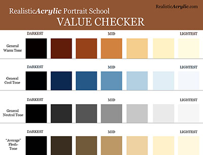
Get the full-resolution 8 1/2″ x 11″ version below…
Get the Value Checker ToolLet me know how this helps! What did you think of this tip on NOT painting teeth white? Did it surprise you?
I’d love to hear how your art journey is going. Shoot me an email and let me know. Or leave a comment. Be blessed in your portrait painting!
Yours for Better Portraits,

Matt
If you found this post helpful or encouraging, would you send it on ahead? Let others know with the share buttons below. I’d love to hear your comments. Thank you so much!

Quick Tip to Set Up a Canvas in Your Easel
Have you ever been frustrated trying to paint the edges of your canvas on an acrylic portrait, because the easel clamps are in the way?
You try to paint the background smoothly, with gestural strokes that flow off the edge of the painting but are inhibited by the easel itself. Let me show you a quick tip to overcome that problem.
How do YOU keep your paintings in place on your easel, and yet make it possible to paint all edges easily? Let me know. Always on the lookout for good ideas. 🙂
P.S. Did you find this post helpful or encouraging? If so, send it on ahead! Let others know with the share buttons below. I’d love to hear your comments. Thank you so much! Also, do you have a question on acrylic portrait painting you’d like answered? Let me know, and I’d be happy to help!

4 Questions About Acrylic Portrait Painting, Answered
Recently, I was asked some questions about acrylic portrait painting. I hope the answers I shared with this artist can be of help to you as well.
1. How do you prepare your canvas panel for painting with Acrylics?
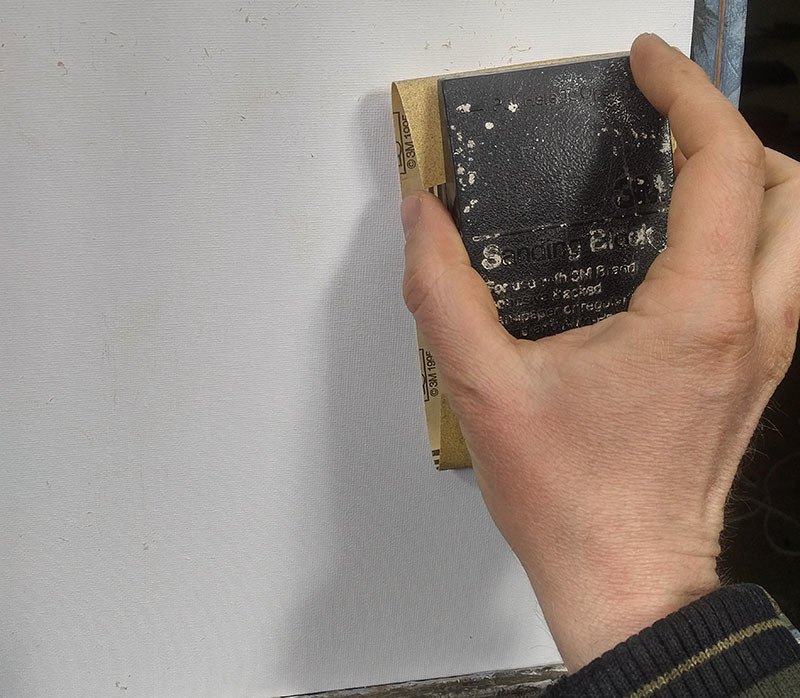
Sanding a canvas panel in preparation for painting an acrylic portrait
2. You spoke of layering your paint when composing a portrait. Please briefly explain.
I use the glazing technique to slowly bring the portrait from a white canvas to completion. The glazing technique is achieved by mixing your paint with clear acrylic medium (usually matte medium) to disperse the pigment, thus allowing light to pass through.
Although you could use water, it’s not recommended, because it breaks down the acrylic resin binder, causing a rough visual texture and possible poor adhesion. For a smoother look, you want to use clear acrylic medium.
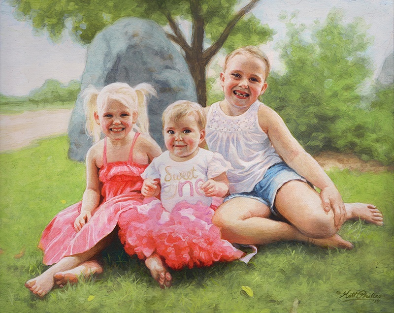
Custom commissioned realistic acrylic portrait from a photo painted by Eau Claire area artist Matt Philleo, ©2019 Fine Art by Matt Philleo
3. You mentioned using a Prismacolor pencil for making your diagram. What color do you recommend?
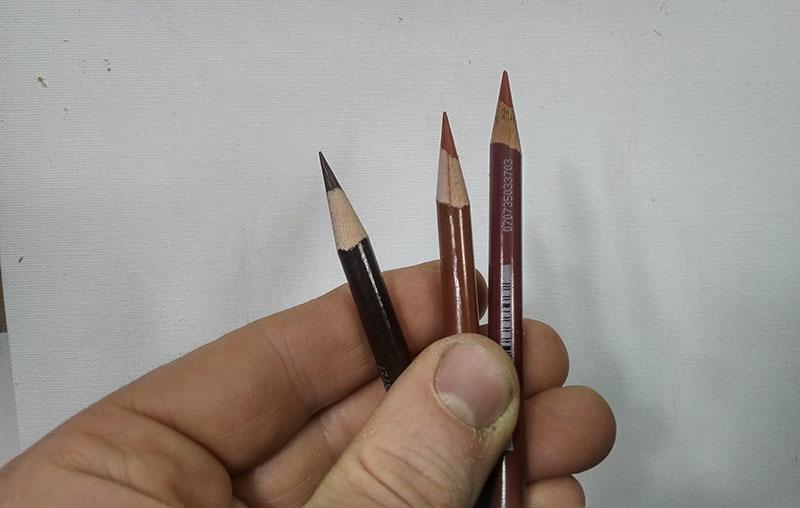
Using colored pencil for your acrylic portrait sketch makes things a lot easier. Technique discovered and developed by Matt Philleo.
4. Do you do the painting from start to finish in one setting?

Acrylic portrait artist Matt Philleo posing in front of a 48″ x 72″ commission painting for a client in Brunei
I hope these questions and answers were helpful to you as well. I know some of this stuff seems pretty basic, but it’s good for all of us to pause and think about why we do what we do. It then makes the doing that much more significant.
Let me know if you have any questions of your own about acrylic portrait painting and I’ll do my best to help!
P.S. Did you find this post helpful or encouraging? If so, send it on ahead! Let others know with the share buttons below. I’d love to hear your comments. Thank you so much! Also, do you have a question on acrylic portrait painting you’d like answered? Let me know, and I’d be happy to help!

How to Paint Realistic Reflections on Eyeglasses in Acrylic Portrait
It’s tricky to paint reflections on eyeglasses.
Creating realistic reflections on eyeglasses can significantly enhance the depth and authenticity of an acrylic portrait. In this blog post, you will learn how to paint realistic reflections on eyeglasses in acrylic portrait and then along with tips for mixing colors, layering, and applying highlights. Because these methods will help elevate your acrylic painting skills and bring your portraits to life.
Understanding Reflections in Eyeglasses
Reflections in eyeglasses are not just simple overlays; yet they play a crucial role in conveying the personality and emotion of your subject. Of course, observing how light interacts with surfaces is essential. Hence, it is vital to capture the subtle nuances of reflections to create a convincing portrayal.
Preparing Your Workspace
Before beginning, ensure your workspace is organized. Then have your reference photo at hand, and gather all necessary materials:
- Acrylic paints: Titanium white, raw umber dark, ivory black, burnt sienna, and alizarin crimson
- Brushes: A round size 8 brush for detail work
- Matte medium for thinning paint
- Palette for mixing colors
- A clean rag for touch-ups
Step-by-Step Techniques
Setting Up the Reference Photo
Zoom in on your reference photo to clearly see the reflections in the glasses. Then identify key areas where reflections appear and note their shape and color.
Mixing the Initial Color
Begin with a mixture of titanium white and raw umber dark to create a toned-down white. Because this will avoid stark brightness that can look unnatural, thin this mixture with matte medium to achieve fluidity.
Painting the Reflections
In this case, use the round brush to carefully apply the mixed color to the upper corners of the glasses. This is where the most pronounced reflections typically occur.
Just observe the shape of the reflections in your reference photo and replicate that shape on your canvas and then using different angles of strokes will help smooth out the paint.
Adding Depth with Multiple Layers
Allow the initial layer to dry before adding more highlights. While layering is essential for creating depth.
Mix a slightly lighter shade then by adding more titanium white to your previous mixture. Apply this lighter color to the same areas, focusing on the edges where the light hits most.
Incorporating Background Elements
To make the reflections believable, you need to incorporate faint outlines of elements visible in the background. This adds realism without overwhelming the portrait.
So use a diluted version of your mixture to achieve this effect, ensuring that the reflections do not detract from the subject’s features.
Enhancing the Frame of the Glasses
The frame should also reflect light. And then apply highlights using the same mixture to the inner edges of the frame.
Gradually build up the highlight by layering, allowing each layer to dry before adding the next.
Adding Shadows for Realism
Shadows are critical for grounding the glasses. When mixing burnt sienna and alizarine crimson, you can create a warm shadow color.
Apply this color underneath the glasses and around the frames to suggest depth and interaction with the face.
Refining the Details
After allowing the previous layers to dry, return with titanium white mixed with raw umber dark for the final highlights.
Focus on adding subtle highlights on the corners of the reflections. Use a very light touch to maintain the transparency of the glass.
Final Touches
Once all elements have dried, step back to evaluate your painting. Then adjust any areas that may need further highlights or shadows to ensure balance and realism. Because this reflective interplay between light and dark is what ultimately gives your portrait a lifelike quality.
Conclusion
Painting realistic reflections on eyeglasses requires patience and practice. So by following these techniques, artists can enhance their acrylic portraits with depth and clarity. Remember also that observation is key; study how light interacts with different surfaces to improve your skill. With dedication, anyone can learn how to paint realistic reflections that bring their acrylic portraits to life.
Tips for Painting Reflections:
- Layering is Key: Always allow layers to dry before adding more to achieve depth.
- Use a Light Touch: When applying highlights, a gentle hand creates a more realistic effect.
- Study Real Life: Observe real eyeglasses in different lighting conditions to understand how reflections work.
For further resources and guides, visit realisticacrylic.com and check out my free courses to enhance your acrylic painting journey.
This is a 16 x 20 acrylic on canvas commissioned portrait, and I just delivered it to the client today. She loved it. It was a memoriam portrait, so I pray it will bring comfort to all who see it.
Have a blessed day, and may God use your artistic gifts to bless people far and wide.
- How to Paint Foliage Using the Acrylic Glazing Technique
- How to Trace for an Accurate Portrait Sketch
- How to Paint Realistic Eyes in Your Acrylic Portrait
- How to Add Raw Umber Dark & Ultramarine Blue to Your Portrait
- How to Make Your Own Raw Umber Dark
- How to Paint Realistic Trees & Grass in Your Acrylic
- How to Block In Skin Tone Values Using Glazing Technique
- How to Paint Vibrant Reds in Your Acrylic Portrait
- How to Glaze Background Colors & More Acrylic Portrait
- How to Paint White Clothing in Your Acrylic Portrait
- How to Easily Transition from a Sketch to a Painting
- How to Block In Shading & Skin Tones in Your Acrylic
- How to Build Up Color on Acrylic Pet Portrait
- How to Build Up Form on Clothing with Acrylic
- How to Paint Dark Clothing Using Acrylic Glazing Technique
- How to Paint a 24 x 30 Acrylic With 30 People
- How to Do Smooth Shading with Acrylic
- How to Sketch an Acrylic Portrait with a Grid
Read more about how to paint a portrait that you can surely be proud of!
I’d love to hear your thoughts about this video. Please share it with your friends and family. Let me know if you have any further questions. I’ll greatly help you.
If you’d like to learn more, sign up for my free email tips and video class today.
Learn How to Paint Acrylic Portraits With My Free Mini-Video Course!
Thank you so much for taking the time to read this tutorial and watch the video. That means a lot to me. I hope you find it very helpful in your portrait painting.
Yours for Better Portraits,
P.S. Did you find this post helpful or encouraging? If so, send it on ahead! Let others know with the share buttons below. I’d love to hear your comments. Thank you so much! Also, do you have a question on acrylic portrait painting you’d like answered? Let me know, and I’d be happy to help!

How to Price Your Finished Portrait Painting?
One question I’m asked again and again is, “How much should I charge for a portrait?”
I was asked this question twice in the last two days, so I figure it would be good to answer this in an article.
As a professional portrait painter, I know that what I charge for my portraits affects my bottom line. If I don’t charge enough, I don’t make enough money to keep painting. If I charge too much, I might price myself out of the market.
You may be asking the same thing? What should you do?
There are many factors in pricing.
It depends how long you have been in business, the level of quality of your work, and how much detail will be in your portrait. I charge by the square inch. I have a pricing formula that I came up with where the price increases exponentially as you increase the size of the painting and add more detail (subjects)
Here is what I charge (as of 2019). I can’t say that it will work for you. (Please, DO NOT copy my prices. I am showing it just as an example. )
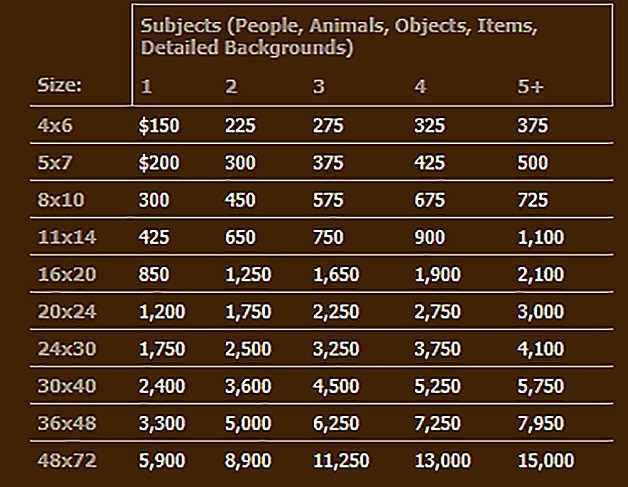
A 16 x 20 with one person—I charge $850 for that. If there are 5 or more subjects (people, objects, detailed backgrounds, etc. ) in the portrait I charge $2,100. The reason I charge more is that it will take longer to paint all the extra detail.
But I have been painting for many years and my prices were less than half this amount when I started out painting portraits full-time, in 2014. Here is my price chart for that year.
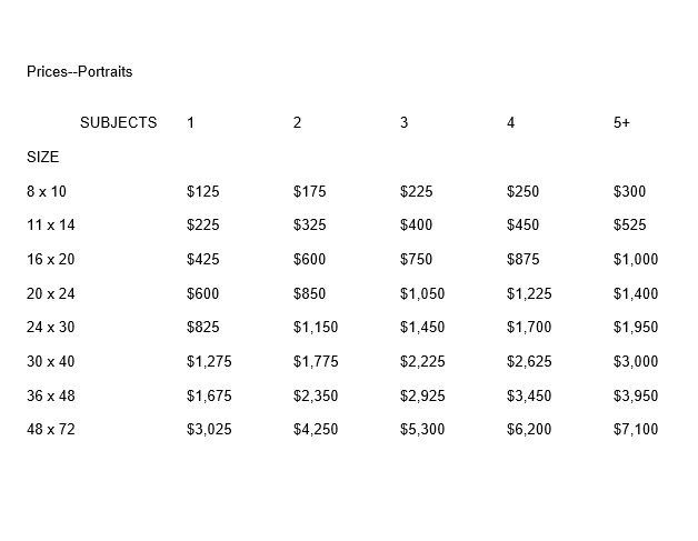
You can see my prices have almost doubled since 2014. And amazingly, at that time, I was struggling to get even one commission! I remember praying every day for a month for a commission, after doing all I knew to do to bring in some work. God did provide one eventually, but I need to learn to trust in Him and be patient. That’s a story for another day. 🙂
The point I’m trying to make is that charging less for your work does not equate to more sales. When I first started I thought I was going well to make minimum wage. That was foolish, because we aren’t painting 100% of the time and we have materials and marketing costs. My wife encouraged me to raise my prices. I was scared to, but it didn’t hurt my business at all. I have been raising them slowly, about 10-20% every year.
So, then, should you charge more at the onset and just watch the sales roll in?
No. It doesn’t work that way either. Charge a fair price for your work, be patient, keep doing portraits, don’t give up when it’s tough, and you will see the results. Raise your prices over time as you build up your clientele.
I try to get paid $50 an hour on my portraits. ( I don’t charge by the hour. This is what I average on my projects.)
Figure out what you’d like to get paid per hour. Then charge approximately 50% more because, as I mentioned earlier, you won’t be painting all the time (you’ve got other business-y things to do) and you have paint and brushes to buy.
Here are some more helpful tips in pricing your art.
1. First of all, create a price chart as I did. This is HUGE. Going to a client meeting to discuss a portrait without a price chart in hand is like going to a smorgasbord buffet line without a plate in hand. It’s going to be messy.
With a price chart all you need to do is ask your client what size they would like–roughly–and then show them a couple of options. You should know how many people will be in the portrait. You simply show them the chart and say, “an 16 x 20 with two subjects will be this much, and a 24 x 30 will be this.” You point to the prices and let the chart do the work.
Let them decide what they want.
There are no negotiations on the price. Because the client sees you have a precise criterion for what you charge—it makes sense—they will not quibble with your price. I can’t recall a time that’s ever happened to me.
Interestingly, I do remember a time when I negotiated my own price down. I offered my client a price that was lower than what I originally quoted. She took the lower price but looked at me strangely and the whole situation was awkward. And I needlessly lost money on the job. Ouch.
Don’t do what I did in that situation.
Quote your price and hold to it. Let them respond.

2. Then, once you have the client locked in on a price, encourage them to pay a down deposit on the spot. If you just give them a business card and let them walk away, chances are, you’ll lose the commission. Of course, if they need to discuss it with another decision maker, that’s fine. But get their phone number or email address so you can follow up with them.
Most of the time, however, they’ll be ready to make a decision if they indeed want a portrait, and not just merely curious.
You can tell them you need the deposit so that you’ll have them booked. That way you can get to their portrait faster.
A deposit is also very important because, with it, the client has “skin in the game.” They’re not as likely to back out of the project.
How much should you ask for a deposit? I ask for 25% up front. Some do 50. But I like 25, because it’s a little less risk for the client to take on, and it also gives me more incentive to finish the project. I get paid a larger amount at the end.
3. Never charge people more because you think they are rich, or less because you think they are poor. Just charge what you charge. Have a size for any budget. The price chart is your best friend. Then you can always point people to your price list and let it do the selling for you.
4. Don’t compete on price. It may be helpful to see what other artists are charging to gauge what you might be able to charge, but don’t make the mistake of thinking you have to beat other artists’ prices. You’re not Walmart. You’re an artist. People will purchase art from you, because they know, like and trust you. They appreciate your unique style, your experience, personality, your connection to them, and that’s a big part of why they will buy from you. So as long as they can technically afford your prices, they will pay them, even if Joe Artist down the street has prices 50% less than you.
5. Never deliver your painting without payment in hand. If you meet with the client personally to deliver the painting, let them know beforehand that you would like to exchange payment for the finished product on the spot. If you are shipping the painting, show them a proof image of the portrait. Once they approve it, ask for the balance to paid in full (along with shipping charges.) When they make payment, then promptly ship the artwork.
That’s it! Of course, there’s more nuances than this to pricing your work, but this article should give you some good information on how to do it, if you’re just starting out in acrylic portrait painting.
Let me know how this helps.
If you are an artist who does commissioned portraits, do you have any tips to share on how YOU price your work? Please share your thoughts in the comments below. 🙂
Yours for better portraits,
P.S. Did you find this post helpful or encouraging? If so, send it on ahead! Let others know with the share buttons below. I’d love to hear your comments. Thank you so much! Also, do you have a question on acrylic portrait painting you’d like answered? Let me know, and I’d be happy to help!

How to Paint Oval Vignette Acrylic Portrait Timelapse
Step-by-step techniques for an elegant oval vignette in acrylic portrait
Creating an acrylic portrait with an oval vignette style is an inspiring technique that allows your subject to stand out elegantly, adding focus and artistry. In this timelapse guide, I’ll walk you through how to achieve an oval vignette acrylic portrait using a unique glazing method. This technique helps you build depth, enhance color vibrancy, and create a finish that rivals the luminosity of oil paintings.
Understanding the Oval Vignette Technique
An oval vignette composition is a traditional approach that frames your subject in a subtle, softly blurred oval shape, gently drawing attention to the portrait’s focal point. This timeless style is ideal for achieving classic, professional results, whether you’re creating family portraits or a commissioned piece.
Step 1: Preparing Your Canvas with Initial Layers
To begin, prep the canvas with a light layer of matte medium and diluted paint. Use raw umber dark, ultramarine blue, and a dash of burnt sienna. This combination will set up foundational tones that help bring warmth and depth later on. Thin layers will be added progressively, each enhancing the portrait’s tonal structure.
Step 2: Blocking in Values and Colors
Blocking in your values provides a strong base for your portrait:
- Start Light: Use thin washes of paint to gradually build values, beginning with the mid-tones.
- Add Color with Glazing: Introduce alizarine crimson and phthalo green in thin layers for the skin, adding natural, warm undertones.
- Maintain Balance: Rather than finishing one section entirely, work across the canvas, applying each color to corresponding areas simultaneously. This approach keeps the portrait harmonious.
Step 3: Building Depth with Glazing Layers
The glazing technique is key to creating a portrait that radiates depth and realism:
- Multiple Layers: Up to 100 ultra-thin layers can be used to achieve a fully nuanced look.
- Lighting Effects: The translucent quality of these layers allows light to reflect off the canvas, creating a sense of depth and vibrancy.
- Oil-Like Finish: This glazing method adds a polish that can make acrylics resemble the look of oil paints, with soft transitions and a luminous finish.
Step 4: Enhancing Realism with Fine Details
As the portrait evolves, focus on adding detail:
- Nuances in Features: To make eyes, lips, and hair appear lifelike, add details like eyelash shadows, fine lines in the lips, and highlights in the irises.
- Gradual Shading: Build up shading in areas like the cheeks, nose, and forehead. A steady hand and attention to small value changes will achieve the realism you want.
- Background and Clothing: Layer in small color adjustments to enhance textures, like the folds of clothing or woodwork in the background.
Step 5: Adding Highlights and Final Touches
In the final stages, highlights and refined details bring the portrait to completion:
- Bright Highlights: Use titanium white mixed with matte medium to add precise highlights to areas like the nose, cheekbones, and chin.
- Softened Borders: To emphasize the oval vignette, blend the edges softly with a semi-dry brush, ensuring a smooth transition from the background to the portrait.
- Review Consistency: Check that all areas of the portrait have been equally developed. Avoid leaving any section overly detailed compared to others, maintaining a cohesive finish.
Tips and Techniques for Glazing Success
- Patience is Key: Building 50-100 layers takes time, but this patience will bring richness and realism.
- Use Matte Medium: It helps dilute the paint to the desired transparency, preserving color vibrancy without compromising texture.
- Rotate Colors: Alternate between colors like raw umber, burnt sienna, and ultramarine blue to create depth and dimension.
- Light Source Consideration: Adjust shading to reflect your portrait’s light source, helping facial features feel three-dimensional.
- Avoid Overworking: While glazing layers add depth, too much reworking can muddy colors. Stick to thin, controlled applications.
Why Glazing Works for Acrylic Portraits
Glazing layers allow light to pass through, reflecting back and adding dimension. Each transparent layer builds on the one before, creating complex color variations. This effect gives the portrait an oil-like appearance, a finish that’s often praised for acrylics. The difference in visual depth between these layers keeps the painting from looking flat and enhances the vignette effect around your subject.
Common Challenges and Solutions
- Colors Look Flat: This can happen if the layers are too thick. Thin out each layer with matte medium and add layers patiently to avoid oversaturation.
- Difficulty with Vignette Edges: Keep edges soft by blending them with a nearly dry brush, creating that gentle fade that defines a vignette style.
- Struggle with Skin Tones: Experiment with a mix of warm and cool shades like raw sienna, burnt sienna, and phthalo green, adjusting layers until the desired tone is achieved.
Final Thoughts
Creating an oval vignette acrylic portrait is a wonderful way to highlight your subject and create a stunning effect that draws the viewer’s eye. With glazing, you can achieve depth and richness that elevate your work and add a touch of timeless beauty. Try this technique on your next portrait to experience the difference it makes in achieving realism and sophistication.
For more tips on acrylic portrait painting, glazing methods, and tutorials on creating depth and realism, visit my site at realisticacrylic.com. This technique, along with many others, will enhance your skills and add a professional touch to your portraits.
Let me know how you enjoyed this video, and if you have any questions on acrylic portrait painting, I’ll be happy to help.
LEARN MORE
- How to Paint Foliage Using the Acrylic Glazing Technique
- How to Trace for an Accurate Portrait Sketch
- How to Paint Realistic Eyes in Your Acrylic Portrait
- How to Add Raw Umber Dark & Ultramarine Blue to Your Portrait
- How to Make Your Own Raw Umber Dark
- How to Paint Realistic Trees & Grass in Your Acrylic
- How to Block In Skin Tone Values Using Glazing Technique
- How to Paint Vibrant Reds in Your Acrylic Portrait
- How to Glaze Background Colors & More Acrylic Portrait
- How to Paint White Clothing in Your Acrylic Portrait
- How to Easily Transition from a Sketch to a Painting
- How to Block In Shading & Skin Tones in Your Acrylic
- How to Build Up Color on Acrylic Pet Portrait
- How to Build Up Form on Clothing with Acrylic
- How to Paint Dark Clothing Using Acrylic Glazing Technique
- How to Paint a 24 x 30 Acrylic With 30 People
- How to Do Smooth Shading with Acrylic
- How to Sketch an Acrylic Portrait with a Grid
Read more about how to paint a portrait that you can surely be proud of!
Let me know how you enjoyed this video and if you have any questions on acrylic portrait painting, I’ll be happy to help.
Yours for better portraits,
P.S. Did you find this post helpful or encouraging? If so, send it on ahead! Let others know with the share buttons below. I’d love to hear your comments. Thank you so much! Also, do you have a question on acrylic portrait painting you’d like answered? Let me know, and I’d be happy to help!

How to Paint Two Bubble Frame Oval Acrylic Portraits
Unlock the secrets to creating captivating two bubble frame oval acrylic portraits
Painting two bubble frame oval acrylic portraits offers a unique opportunity to explore creativity and technique while crafting eye-catching artwork. In this guide, you’ll discover the essential steps to create stunning portraits that showcase not only your artistic skills but also the charming oval frames that elevate your paintings. Whether you’re a beginner or an experienced artist, you’ll learn how to blend colors effectively, capture realistic features, and compose your portraits for maximum impact. Let’s dive into the world of acrylic painting and bring your two bubble frame oval acrylic portraits to life!
How is my portrait project coming along?
“Um, I haven’t even started it yet.”
“Oh. Could you do another one and get it done for me by Christmas?”
“Let me check. Sure.”
This is kind of how the conversation went when a client called me on a portrait project that I had scheduled out for a few months. I was backed up with commissions, and it was already well into December.
Do another portrait when I was already behind? Why not? I thrive on a little deadline pressure. I’ve got an extra reserve of midnight oil 🙂
So here are the portraits I created, two convex-oval 14″ x 20″ acrylic on canvas paintings. I decided to work on both at once. And I got them both done in time, too, by God’s grace!
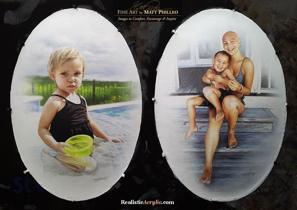
And now I want to show you how I painted them. I’ll take you through the process from the colors I select for the palette, the first few layers, all the way to the completed painting.
How I Painted These Oval Vintage Acrylic Portraits
This tutorial is a work in progress, so I’ll be adding more videos in the future!
Keep in touch and I’ll let you know when I post the next one!
Let me know how this tutorial helps!
Have you ever painted on an oval canvas or unusual surface before? If so, leave a comment and tell me about it. Have a blessed day!
LEARN MORE
- How to Paint Foliage Using the Acrylic Glazing Technique
- How to Trace for an Accurate Portrait Sketch
- How to Paint Realistic Eyes in Your Acrylic Portrait
- How to Add Raw Umber Dark & Ultramarine Blue to Your Portrait
- How to Make Your Own Raw Umber Dark
- How to Paint Realistic Trees & Grass in Your Acrylic
- How to Block In Skin Tone Values Using Glazing Technique
- How to Paint Vibrant Reds in Your Acrylic Portrait
- How to Glaze Background Colors & More Acrylic Portrait
- How to Paint White Clothing in Your Acrylic Portrait
- How to Easily Transition from a Sketch to a Painting
- How to Block In Shading & Skin Tones in Your Acrylic
- How to Build Up Color on Acrylic Pet Portrait
- How to Build Up Form on Clothing with Acrylic
- How to Paint Dark Clothing Using Acrylic Glazing Technique
- How to Paint a 24 x 30 Acrylic With 30 People
- How to Do Smooth Shading with Acrylic
- How to Sketch an Acrylic Portrait with a Grid
Read more about how to paint a portrait that you can surely be proud of!
Yours for better portraits,
P.S. Did you find this post helpful or encouraging? If so, send it on ahead! Let others know with the share buttons below. I’d love to hear your comments. Thank you so much! Also, do you have a question on acrylic portrait painting you’d like answered? Let me know, and I’d be happy to help!