Category Archives for Step-by-Step Tutorial

How to Paint Mountains in the Distance with Acrylic
Transform your landscape paintings with these acrylic glazing tips for distant mountains
Painting distant mountains can add a breathtaking sense of depth and realism to your landscape artworks. Using acrylic glazing techniques allows you to achieve this effect with stunning results. In this guide, we’ll explore how to paint mountains in the distance, focusing on essential techniques and tips to enhance your artwork.
Understanding the Basics of Acrylic Glazing
Acrylic glazing involves applying thin, transparent layers of paint over dry layers to modify their color and tone. This technique is particularly effective for creating depth and atmospheric perspective in landscape paintings. To paint distant mountains, you’ll use glazing to create subtle color shifts and soften the edges, mimicking the natural effects of atmospheric conditions.
1. Preparing Your Canvas and Palette
Start by setting up your canvas and preparing your palette with the essential colors. For distant mountains, you’ll need:
- Titanium White: For highlights and mixing with other colors.
- Pyrrole Orange: To warm up certain areas and add vibrancy.
- Indian Yellow: For creating warm undertones.
- Naphthol Red: To introduce a reddish hue where needed.
- Ultramarine Blue: To create cool, distant tones.
- Raw Umber Dark: For deeper shadows and earthy tones.
Mix these colors to achieve a range of cool and warm tones suitable for distant mountains. Remember, cooler tones often recede into the background, while warmer tones advance.
2. Creating the Base Layers
Using a small, round brush, start by applying a base layer of color to your mountains. For distant mountains, use a mix of ultramarine blue and raw umber dark to create a soft, muted base. This will set the foundation for the distant appearance of the mountains.
Apply the paint in broad, sweeping strokes, mimicking the natural contours of mountain ranges. Focus on creating a gradient from darker tones at the base to lighter tones towards the top, simulating distance and elevation.
3. Adding Depth with Glazing
Once your base layer is dry, begin glazing to add depth and nuance. Mix a thin, transparent glaze using titanium white and a touch of pyrrole orange for highlights. Apply this glaze over the base layer to create the appearance of light hitting the mountain peaks.
Tip: Apply glazes in thin layers and build up gradually. This approach allows you to control the intensity and achieve a more natural look.
4. Creating Atmospheric Perspective
Atmospheric perspective is key to making mountains look distant. Use cooler tones, like a mix of ultramarine blue and naphthol red to add a hazy effect. Apply these colors lightly to areas that are farther away, softening the edges and blending them into the background.
Avoid using bright or saturated colors for distant mountains, as this can make them appear closer than they are. Instead, rely on muted, cool colors to maintain the illusion of depth.
5. Adding Highlights and Shadows
To enhance the three-dimensional quality of your mountains, add highlights and shadows. For highlights, use a mix of titanium white and indian yellow. Lightly apply this mixture to the mountain peaks and ridges where the light source is strongest.
For shadows, deepen the areas with raw umber dark mixed with a touch of ultramarine blue. Apply these shadows to areas that are obscured from the light, creating contrast and depth.
Tip: Ensure that your highlights and shadows follow the natural contours of the mountains. This adds realism and prevents your painting from looking flat.
6. Blending and Refining
Once you’ve added highlights and shadows, blend the colors to smooth transitions between different tones. Use a clean, dry brush or a blending brush to gently blend the edges where the colors meet. This technique helps to soften any harsh lines and creates a more seamless look.
Focus on areas where the light and shadow meet, ensuring that the transitions are smooth and natural.
7. Final Touches
Add any final details or touches to enhance the realism of your mountains. Check for any gaps or areas that need additional color adjustments. Use a fine brush to add small details or adjust highlights and shadows as needed.
Tip: Step back from your painting periodically to evaluate the overall effect. This perspective helps you see any areas that might need adjustment or refinement.
Painting mountains in the distance with acrylic glazing techniques can transform your landscape paintings, adding depth and realism. By using cool tones, creating atmospheric perspective, and carefully applying highlights and shadows, you can achieve a stunning portrayal of distant mountain ranges. Practice these techniques, and soon you’ll be able to create landscapes with breathtaking depth and dimension.
For more tips and tutorials on acrylic painting, visit https://realisticacrylic.com/tutorials/ to learn more and check out my free courses. Whether you’re a beginner or an experienced artist, there’s always something new to learn and apply to your paintings. Happy painting!
- Sketching Your Painting Accurately
- Beginning a Pet Portrait in Acrylic
- The Mystery of Realism in Painting
- Apply A Burnt Sienna Glaze to a Portrait
- Learn How to Sketch a Portrait Freehand in 45 Minutes
- Adding highlights to your acrylic painting
- 5 Excellent Reasons to Use Aluminum Foil
- Paint Realistic Wrinkles in Acrylic
- Painting Clothing in an Acrylic Portrait
- Paint a Cloudy Sky Acrylic
- How to add Semi-Opaque Highlights
- How to Enhance the Contrast in Your Acrylic
- How to Add Glaze to Your Acrylic Painting
- Paint Realistic Reflections on Eyeglasses in an Acrylic Portrait
- Build Up Depth on Your Acrylic Portrait Backgrounds
- How Do You Do Layers With the Glazing Technique?
- Learn How to Paint Wrinkles in Acrylic
Read more about how to paint a portrait that you can surely be proud of!
I’d love to hear your thoughts on this video. Please share it with your friends and family. Let me know if you have any further questions. I’ll greatly help you.
If you’d like to learn more, sign up for my free email tips and video class today.
Learn How to Paint Acrylic Portraits With My Free Mini-Video Course!
Thank you so much for taking the time to read this tutorial and watch the video. That means a lot to me. I hope you find it very helpful in your portrait painting.
Yours for Better Portraits,

P.S. Did you find this post helpful or encouraging? If so, send it in ahead! Let others know with the share buttons below. I’d love to hear your comments. Thank you so much! Also, do you have a question on acrylic portrait painting you’d like answered? Let me know, and I’d be happy to help!

How to Paint Golden Dog Fur with Glazes in Acrylic
Learn the art of painting realistic golden fur with layered glazing techniques
Introduction
Painting fur, especially the luxurious golden tones of a dog’s coat, can be both challenging and rewarding. This guide will walk you through the process of how to paint golden dog fur using acrylic glazes to achieve a realistic fur texture. Capturing the softness and depth that make your pet portraits stand out. By layering colors and adding subtle details, you can create a painting that feels lifelike and rich in detail.
Step 1: Preparing Your Painting
Before diving into the glazing process, ensure your painting is at the mid-point of completion. You should have the basic colors, values, and contrasts laid out. For this demonstration, the subject is an 8×10 commission portrait of a dog, with the fur already sketched and the initial layers of paint applied.
Step 2: Choosing Your Colors and Medium
The key to painting realistic fur lies in the selection of colors and the medium. For golden fur, start with a clear glazing medium mixed with raw umber dark—a deep, rich brown that’s essential for adding depth. This color will serve as the base for building up the layers of fur.
Step 3: Applying the First Glaze
Dip your brush into the glazing medium and add a small amount of raw umber. The goal is to create a translucent layer that enhances the existing colors without overwhelming them. Gently brush this glaze over the fur, focusing on areas where you want to deepen the shadows and add warmth. Use your finger to softly blend the edges, ensuring a smooth transition between the glazed areas and the underlying paint.
Step 4: Building Depth with Additional Glazes
Continue adding layers of glaze to build depth in the fur. To enhance the natural tones, mix a touch of alizarine crimson with the raw umber, creating a warm, reddish-brown hue. Apply this mixture to areas like the ears and around the eyes, where the fur naturally darkens. Remember to work in thin layers, gradually building up the color intensity.
Step 5: Adjusting Tones and Highlights
As you layer your glazes, you might find some areas becoming too warm or dark. To balance this, mix in a small amount of white with your glazing medium. White has a cooling effect, which can help to tone down overly warm areas. Apply this cooler glaze to sections of the fur that need to recede or appear lighter. For instance, if the body of the dog appears too dark compared to the reference photo, this cool glaze can help bring it closer to the desired tone.
Step 6: Adding Fine Details
Once you’ve built up the depth and tone, it’s time to add the finer details that make the fur appear realistic. Use a small, pointed brush to carefully darken areas between individual strands of fur, particularly around the dog’s eyes, nose, and forehead. These darker details will give the fur its texture and make the painting pop.
Step 7: Balancing Opacity and Transparency
While glazes add beautiful translucency to your painting, it’s important to balance this with some areas of opacity. Opaque layers, when used sparingly, can enhance the richness and substance of the fur. Mix your paint with less medium to create these opaque layers, and apply them strategically where the fur appears thickest or where you want to emphasize highlights.
Step 8: Final Adjustments and Highlights
As you near the completion of the painting, step back and evaluate the overall composition. Are there areas that need more contrast? Do certain sections of fur need to be lightened or darkened? Make these adjustments with additional glazes or opaque layers as needed. Finally, add the brightest highlights to the fur, using a nearly opaque mix of white and your chosen colors. These highlights should be applied sparingly, focusing on the areas where the light naturally hits the fur.
Tips and Techniques:
- Work in Layers: Building up the fur with multiple thin glazes allows you to achieve a rich, realistic texture.
- Use a Soft Brush: For blending glazes, a soft brush works best to avoid harsh lines.
- Keep Your Palette Fresh: As the medium starts to dry, refresh your palette to maintain the fluidity of the paint.
- Experiment with Color: Don’t be afraid to adjust your glazes with different color mixes to match the fur’s tone.
Painting golden dog fur with acrylic glazes is a technique that requires patience and practice, but the results are well worth the effort. By layering colors and carefully balancing opacity with transparency, you can create a portrait that truly captures the essence of your furry subject. Whether you’re a beginner or an experienced artist, these techniques will help you elevate your pet portraits to new levels of realism.
Read more about my additional resources, tutorials, to learn more and check out my free courses here. Whether you’re a beginner or an experienced artist, there’s always something new to learn and apply to your paintings. Happy painting!
- Sketching Your Painting Accurately
- Beginning a Pet Portrait in Acrylic
- The Mystery of Realism in Painting
- Apply A Burnt Sienna Glaze to a Portrait
- Learn How to Sketch a Portrait Freehand in 45 Minutes
- Adding highlights to your acrylic painting
- 5 Excellent Reasons to Use Aluminum Foil
- Paint Realistic Wrinkles in Acrylic
- Painting Clothing in an Acrylic Portrait
- Paint a Cloudy Sky Acrylic
- How to add Semi-Opaque Highlights
- How to Enhance the Contrast in Your Acrylic
- How to Add Glaze to Your Acrylic Painting
- Paint Realistic Reflections on Eyeglasses in an Acrylic Portrait
- Build Up Depth on Your Acrylic Portrait Backgrounds
- How Do You Do Layers With the Glazing Technique?
- Learn How to Paint Wrinkles in Acrylic
Read more about how to paint a portrait that you can surely be proud of!
I’d love to hear your thoughts on this video. Please share it with your friends and family. Let me know if you have any further questions. I’ll greatly help you.
If you’d like to learn more, sign up for my free email tips and video class today.
Learn How to Paint Acrylic Portraits With My Free Mini-Video Course!
Thank you so much for taking the time to read this tutorial and watch the video. That means a lot to me. I hope you find it very helpful in your portrait painting.
Yours for Better Portraits,
P.S. Did you find this post helpful or encouraging? If so, send it in ahead! Let others know with the share buttons below. I’d love to hear your comments. Thank you so much! Also, do you have a question on acrylic portrait painting you’d like answered? Let me know, and I’d be happy to help!

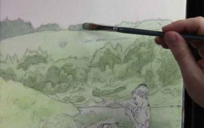
How to Paint Realistic Trees & Landscapes: Technique
I’ll show you what colors to use (and why), how to mix the paint with matte medium for the glazing technique
Introduction
Creating realistic trees and landscapes in acrylic paintings can be a rewarding yet challenging task. The secret to mastering this lies in the glazing technique, which allows for depth, luminosity, and a natural appearance. In this guide, we’ll walk through a detailed process to help you bring your landscape elements to life. And I’ll show you how I paint realistic trees & landscapes using a technique and a step-by-step process.
Understanding the Glazing Technique
Glazing is a fundamental technique in acrylic painting, where you apply thin layers of translucent paint to build depth and vibrancy. This method is particularly useful when painting backgrounds, like trees in landscapes, as it preserves the underlying sketch while adding color and detail gradually.
Materials Needed:
- Acrylic paints (ultramarine blue, phthalo blue, titanium white, raw sienna, raw umber dark)
- Matte medium
- Brushes (quarter-inch flats, rounds, filberts)
- Palette for mixing colors
Step-by-Step Process:
- Mixing the Glaze: Start by creating your glaze mixture. Combine a small amount of paint with a generous amount of matte medium. The matte medium is a clear acrylic without pigment, allowing for translucent layers that maintain the integrity of your initial sketch.
- Choosing the Right Colors: Begin with subdued colors for the background, as these will give the illusion of distance. For instance, mix ultramarine blue with raw sienna to create a subdued green. To add variety, incorporate phthalo blue and titanium white, adjusting with raw umber dark to neutralize any intensity.
Painting Trees in the Distance
To create realistic trees in the background, focus on cooler, less intense colors. These colors recede visually, making the trees appear further away.
- Block in the Shapes: Use a mix of phthalo blue, ultramarine blue, and a touch of titanium white for the distant trees. Lightly apply this mix to establish the overall shape, not worrying too much about staying within the lines—overlapping can be adjusted later with background colors.
- Adjusting Tones: If your color is too vibrant, add raw umber dark, to tone it down, creating a more natural look. This step is crucial, as it ensures that your distant trees don’t overpower the foreground elements.
- Layering with Glazes: Continue layering glazes to build up the form of the trees. Use a dry-brush technique to add subtle transitions between light and shadow, which will give your trees a more three-dimensional appearance. Remember, the goal is to see the abstraction within realism—simplify complex shapes into manageable forms.
Bringing the Midground to Life
The midground trees and landscape elements should be more defined than those in the background but still less intense than the foreground.
- Creating Midground Colors: For the midground, slightly warm up your color palette by adding more raw sienna to the mix. This will create a gentle contrast between the cooler background trees and the warmer midground.
- Detailing with Brushwork: Use smaller brushes to add details like branches and foliage. Focus on capturing the shapes and shadows without getting too detailed, as this can detract from the overall realism. It’s about striking a balance between simplicity and complexity.
Final Touches: Adding Depth to the Foreground
The foreground is where you can introduce the most detail and contrast, drawing the viewer’s eye.
- Darkening the Shadows: To add depth, mix a darker shade by combining ultramarine blue, phthalo blue, and a bit of raw umber dark. Apply this to the base of the trees and other shadowed areas.
- Highlighting with Glazes: Use warm glazes to highlight areas where light would naturally hit. This will make the trees and landscape pop, giving the impression of sunlight filtering through.
- Maintaining Color Harmony: As you paint, continually ask yourself where else you can apply the current color mix. This promotes harmony across the painting and helps unify the different elements.
The glazing technique is a powerful tool for creating realistic trees and landscapes in acrylic paintings. By layering translucent colors and focusing on the subtle interplay of light and shadow, you can achieve a natural and immersive scene. Remember to be patient and allow the process to unfold gradually. With practice, you’ll find that your ability to capture the beauty of nature in your paintings will significantly improve.
Tips and Techniques Recap:
- Use matte medium to create translucent glazes.
- Start with cooler, subdued colors for distant trees.
- Layer glazes to build depth and form.
- Strike a balance between simplicity and detail.
- Apply color harmony by reusing mixtures across the painting.
By incorporating these techniques, you’ll elevate your landscape paintings, making them more lifelike and captivating.
Read more about my additional resources, tutorials, to learn more and check out my free courses here. Whether you’re a beginner or an experienced artist, there’s always something new to learn and apply to your paintings. Happy painting!
- Sketching Your Painting Accurately
- Beginning a Pet Portrait in Acrylic
- The Mystery of Realism in Painting
- Apply A Burnt Sienna Glaze to a Portrait
- Learn How to Sketch a Portrait Freehand in 45 Minutes
- Adding highlights to your acrylic painting
- 5 Excellent Reasons to Use Aluminum Foil
- Paint Realistic Wrinkles in Acrylic
- Painting Clothing in an Acrylic Portrait
- Paint a Cloudy Sky Acrylic
- How to add Semi-Opaque Highlights
- How to Enhance the Contrast in Your Acrylic
- How to Add Glaze to Your Acrylic Painting
- Paint Realistic Reflections on Eyeglasses in an Acrylic Portrait
- Build Up Depth on Your Acrylic Portrait Backgrounds
- How Do You Do Layers With the Glazing Technique?
- Learn How to Paint Wrinkles in Acrylic
Read more about how to paint a portrait that you can surely be proud of!
I’d love to hear your thoughts on this video. Please share it with your friends and family. Let me know if you have any further questions. I’ll greatly help you.
If you’d like to learn more, sign up for my free email tips and video class today.
Learn How to Paint Acrylic Portraits With My Free Mini-Video Course!
Thank you so much for taking the time to read this tutorial and watch the video. That means a lot to me. I hope you find it very helpful in your portrait painting.
Yours for Better Portraits,
P.S. Did you find this post helpful or encouraging? If so, send it in ahead! Let others know with the share buttons below. I’d love to hear your comments. Thank you so much! Also, do you have a question on acrylic portrait painting you’d like answered? Let me know, and I’d be happy to help!

How To Paint Golden Fields Under Crimson Trees:30 Minute Acrylic
Capture the essence of autumn with this quick and vibrant acrylic landscape
Introduction
Autumn is a season of vibrant colors, with trees adorned in hues of crimson, orange, and gold. Capturing this beauty on canvas can be a rewarding challenge for any artist. In this tutorial, we’ll explore how to paint a stunning landscape featuring golden fields under crimson trees using acrylic paints. This guide is based on a 30-minute painting session, so it’s perfect for those who want to create a quick yet impactful artwork. Let’s dive into the steps, colors, and techniques needed to bring this autumn scene to life.
Materials You Will Need
- Canvas: 8×10 inch white canvas board
- Acrylic Paints:
- Ivory Black
- Raw Umber
- Dark Burnt Sienna
- Raw Sienna
- Ultramarine Blue
- Alizarine Crimson
- Naphthol Red
- Pyrrole Orange
- Indian Yellow
- Titanium White
- Brushes:
- Quarter-inch flat brush
- Medium flat brush
- Detail brush
- Palette
- Water and Cloth for Cleaning Brushes
- Matte Medium (Optional)
Step 1: Setting the Scene
Before starting your painting, it’s essential to set up a scene in your mind or use a reference photo. For this tutorial, we’re inspired by a pictures autumn view from Wisconsin, where golden fields stretch under a canopy of crimson trees.
Blocking in the Horizon
Begin by establishing your horizon line on the canvas. This line should sit slightly below the center, following the golden mean, which is not quite the halfway mark but a bit above a third. This placement will help balance your composition.
Mix a base color using ultramarine blue, raw sienna, and titanium white to create a soft greenish tone for the distant trees. Use a medium flat brush to block in the horizon line and the general structure of the fields and hills.
Step 2: Painting the Fields
The golden fields are the focal point of this painting. To achieve the rich tones of harvested crops, mix burnt sienna, raw sienna, and titanium white to create a warm base color. Apply this mixture to the foreground, using broad, horizontal strokes to suggest the flow of the field.
For the mid-ground, lighten the base color by adding more titanium white and a touch of indian yellow. This area should be slightly lighter to create depth and distance. Apply firm pressure with your brush to create a sense of texture in the field.
Step 3: Creating the Distant Hills
The distant hills should be a lighter, more subdued version of the field colors. Mix titanium white, phthalo blue, and indian yellow to create a muted greenish-blue tone. Apply this color to the hills in the background, keeping your brushstrokes soft and horizontal.
This muted tone will help push the hills further back in the composition, creating a sense of depth.
Step 4: Adding the Crimson Trees
Now comes the exciting part—adding the vibrant crimson trees that will dominate the upper part of the composition. Mix pyrrole orange, alizarine crimson, and a touch of indian yellow to create a fiery red-orange color. Use a small flat brush to apply this color in dabs and strokes, mimicking the natural shape of tree foliage.
Pay attention to the placement of these trees. Group them in clusters to avoid a pattern-like appearance, which can make the painting look unnatural. Place the trees slightly off-center to create a more dynamic composition.
Step 5: Enhancing the Colors
To make the trees stand out even more, layer in highlights and additional tones. Mix titanium white with pyrrole orange for brighter highlights, and with indian yellow for golden touches. Apply these colors to the tops of the trees, where sunlight would naturally hit, creating a vibrant glow.
You can also add a few touches of bright green to the trees by mixing phthalo blue with indian yellow and titanium white. This will add variety and realism to the foliage.
Step 6: Introducing the Foreground Trees
To frame the scene, add darker trees in the foreground. Mix raw sienna, ultramarine blue, and ivory black to create a deep, dark green. Use a small flat brush to paint the silhouettes of trees and bushes in the foreground. These trees should be darker and more detailed to draw the viewer’s eye into the scene.
Step 7: Final Touches and Details
With the main elements in place, it’s time to refine your painting with final details. Add texture to the trees by using a dry-brush technique—lightly drag a nearly dry brush with a small amount of paint over the canvas to create the illusion of leaves and branches.
If needed, add more highlights to the tops of the trees and fine-tune the colors in the fields. You can also use a detail brush to add small branches or leaves that catch the light.
Finally, paint the sky using a mix of titanium white and a tiny amount of ultramarine blue to create a soft, pale blue. The sky should be light and slightly gray, complementing the warm tones of the landscape below.
Tips & Techniques
- Use a Reference: Always have a reference photo or real-life scene in mind. This helps maintain accuracy and enhances the realism of your painting.
- Layering Colors: Start with darker tones and gradually layer lighter colors on top. This technique adds depth and dimension to your painting.
- Brush Control: For more control over the shapes and textures, use smaller brushes for details and larger brushes for broader areas.
- Timing: Remember, this is a 30-minute painting session. Keep your strokes deliberate and avoid overworking any part of the painting.
Painting an autumn landscape in just 30 minutes is not only possible but also a rewarding experience. By following these steps, you can capture the essence of golden fields under crimson trees and bring a slice of autumn’s beauty to your canvas. Don’t worry if it doesn’t turn out perfect—each painting is a learning opportunity. Keep practicing, and soon you’ll master the art of quick, vibrant landscapes.
Read more about my additional resources, tutorials, to learn more and check out my free courses.
- Sketching Your Painting Accurately
- Beginning a Pet Portrait in Acrylic
- The Mystery of Realism in Painting
- Apply A Burnt Sienna Glaze to a Portrait
- Learn How to Sketch a Portrait Freehand in 45 Minutes
- Adding highlights to your acrylic painting
- 5 Excellent Reasons to Use Aluminum Foil
- Paint Realistic Wrinkles in Acrylic
- Painting Clothing in an Acrylic Portrait
- Paint a Cloudy Sky Acrylic
- How to add Semi-Opaque Highlights
- How to Enhance the Contrast in Your Acrylic
- How to Add Glaze to Your Acrylic Painting
- Paint Realistic Reflections on Eyeglasses in an Acrylic Portrait
- Build Up Depth on Your Acrylic Portrait Backgrounds
- How Do You Do Layers With the Glazing Technique?
- Learn How to Paint Wrinkles in Acrylic
Read more about how to paint a portrait that you can surely be proud of!
I’d love to hear your thoughts on this video. Please share it with your friends and family. Let me know if you have any further questions. I’ll greatly help you.
If you’d like to learn more, sign up for my free email tips and video class today.
Learn How to Paint Acrylic Portraits With My Free Mini-Video Course!
Thank you so much for taking the time to read this tutorial and watch the video. That means a lot to me. I hope you find it very helpful in your portrait painting.
Yours for Better Portraits,
P.S. Did you find this post helpful or encouraging? If so, send it in ahead! Let others know with the share buttons below. I’d love to hear your comments. Thank you so much! Also, do you have a question on acrylic portrait painting you’d like answered? Let me know, and I’d be happy to help!

How to Use Halation to Improve Vibrance and Realism
Learn how to add warmth and depth to your portraits with this simple yet powerful technique
Introduction
When it comes to portrait painting, achieving vibrance and realism can be a challenging task. However, with the right techniques, you can bring your paintings to life with rich colors and dynamic contrast. One such technique is halation, a method that involves adding warmer tones at the edges of light and dark values. This blog post will guide you through the process of using halation to improve the vibrance and realism in your acrylic paintings, inspired by the works of artists like Wayne Thiebaud.
What is Halation?
Halation is a technique where warmer tones are applied at the junctions between light and dark values in a painting. This creates a glowing effect, adding depth and energy to the artwork. The term “halation” is derived from the word “halo,” which refers to the glowing ring often seen around a light source. In painting, this technique can be used to enhance the visual impact of the artwork, especially in scenes with dramatic lighting.
Why Use Halation?
The use of halation can significantly enhance the vibrance and realism of a painting. By adding warm tones, such as reds, oranges, and yellows, at the edges where light meets shadow, the painting gains a dynamic contrast that draws the viewer’s eye. This technique is particularly effective in creating a sense of depth and making the subjects in the painting stand out. Additionally, halation can evoke a warm, glowing atmosphere, which is especially useful in scenes with strong sunlight or other light sources.
The Halation Technique in Action
In the video, I’ll demonstrate the use of halation while working on a 30×40 acrylic portrait of Moses, Aaron, and Hur during the Amalakite battle. The scene is set with extreme lighting, where most subjects are in shadow with strong illumination hitting just the edges. Here’s how halation is applied in this scenario:
- Choosing the Right Colors:
I uses a combination of pyrrole orange and indian yellow to create the warm tones needed for halation. These colors are vibrant and stand out well against the darker background, making them ideal for this technique. - Applying Warm Tones:
Using a round brush, I carefully applies these warm tones at the junctions between light and dark values. For example, around Moses’ face, the edges of the clothing, and even on the rocks and clouds. The goal is to highlight the areas where the light meets the shadow, creating a glowing effect. - Maintaining the Lighting Scenario:
The halation technique is particularly effective in scenes with dramatic lighting, such as the low sunlight depicted in this painting. By adding warm tones in these high-contrast areas, the painting maintains a consistent lighting scenario that enhances the overall realism. - Creating Visual Impact:
As the warmer tones are added, the painting begins to take on a more vibrant and energetic feel. The halation effect draws the viewer’s attention to the key elements of the painting, such as the faces of the subjects and the illuminated edges of their clothing. This not only improves the vibrance but also adds a sense of movement and life to the scene.
Tips and Techniques for Using Halation
- Select the Right Colors:
When choosing colors for halation, opt for warm, vibrant hues like reds, oranges, and yellows. These colors should complement the existing palette of your painting while standing out enough to create the desired contrast. - Use a Fine Brush:
Precision is key when applying halation. Use a fine, round brush to carefully add the warm tones at the edges of light and dark values. This ensures that the halation effect is subtle yet impactful. - Balance the Effect:
While halation can add vibrance, it’s important not to overdo it. Apply the warm tones sparingly, focusing on the areas of highest contrast. This will prevent the painting from becoming too saturated and losing its realism. - Practice on Smaller Areas First:
If you’re new to halation, start by practicing on smaller areas of your painting. Experiment with different colors and brush techniques to see how the effect changes the overall look of the artwork. - Study the Masters:
Artists like Wayne Thiebaud have mastered the halation technique. Study their works to see how they use warm tones to enhance vibrance and realism. This can provide inspiration and guidance as you incorporate halation into your own paintings.
Halation is a powerful technique that can transform your acrylic paintings, adding vibrance and realism by carefully placing warm tones at the edges of light and dark values. Whether you’re working on a dramatic battle scene or a serene portrait, mastering halation will elevate your art to new levels of depth and energy. Start experimenting with this technique today, and watch as your paintings come to life with color and light.
For more tips and tutorials on acrylic painting, be sure to check out my website at www.realisticacrylic.com, and my free course. Where you can find a wealth of resources to help you improve your skills and create stunning artwork. Happy painting!
- Sketching Your Painting Accurately
- Beginning a Pet Portrait in Acrylic
- The Mystery of Realism in Painting
- Apply A Burnt Sienna Glaze to a Portrait
- Learn How to Sketch a Portrait Freehand in 45 Minutes
- Adding highlights to your acrylic painting
- 5 Excellent Reasons to Use Aluminum Foil
- Paint Realistic Wrinkles in Acrylic
- Painting Clothing in an Acrylic Portrait
- Paint a Cloudy Sky Acrylic
- How to add Semi-Opaque Highlights
- How to Enhance the Contrast in Your Acrylic
- How to Add Glaze to Your Acrylic Painting
- Paint Realistic Reflections on Eyeglasses in an Acrylic Portrait
- Build Up Depth on Your Acrylic Portrait Backgrounds
- How Do You Do Layers With the Glazing Technique?
- Learn How to Paint Wrinkles in Acrylic
Read more about how to paint a portrait that you can surely be proud of!
I’d love to hear your thoughts on this video. Please share it with your friends and family. Let me know if you have any further questions. I’ll greatly help you.
If you’d like to learn more, sign up for my free email tips and video class today.
Learn How to Paint Acrylic Portraits With My Free Mini-Video Course!
Thank you so much for taking the time to read this tutorial and watch the video. That means a lot to me. I hope you find it very helpful in your portrait painting.
Yours for Better Portraits,
P.S. Did you find this post helpful or encouraging? If so, send it in ahead! Let others know with the share buttons below. I’d love to hear your comments. Thank you so much! Also, do you have a question on acrylic portrait painting you’d like answered? Let me know, and I’d be happy to help!

How to Save Money on Your Acrylic Paint
Discover tips and techniques to maximize your painting budget.
Introduction:
Acrylic paint is a versatile medium loved by artists for its quick-drying properties, vibrant colors, and adaptability. However, the costs can add up, especially when you’re working on large projects or creating art regularly. In this guide, I’ll share practical tips on how to save money on your acrylic paint without compromising on quality. Whether you’re a seasoned artist or just starting, these strategies will help you stretch your budget further.
1. Choose Affordable Yet High-Quality Paint Brands:
One of the most effective ways to save money on acrylic paint is by choosing affordable yet high-quality brands. For instance, Nova Color is an excellent alternative to more expensive brands like Liquitex and Winsor & Newton. Manufactured in Culver City, California, Nova Color cuts out the middleman by selling directly to artists. This results in significant savings—often around a third or half the price of other premium brands.
Why Nova Color?
- High Pigment Saturation: Nova Color offers vibrant, saturated colors, ideal for glazing techniques.
- Quality Resin Binder: The high-quality polymer resin binder ensures the paint’s longevity and resilience.
- Cost-Effective: You get the same quality at a fraction of the cost, making it a smart choice for artists on a budget.
2. Buy in Bulk:
Another effective way to save money is by purchasing your paint in larger quantities. For example, you can buy a gallon of matte medium from Nova Color for the same price you’d pay for a quart at a traditional art store. This approach is especially beneficial for artists who paint frequently, as it significantly reduces the cost per ounce.
Benefits of Buying in Bulk:
- Lower Cost per Unit: The larger the quantity, the lower the cost per ounce.
- Fewer Purchases: Reduces the frequency of purchases, saving time and potential shipping costs.
3. Efficient Paint Dispensing:
While bulk buying is cost-effective, it can be cumbersome to work with large containers of paint. Instead of using spoons to transfer paint from a gallon container to your palette—an often messy and inefficient process—consider transferring the paint into smaller, more manageable containers.
Use Squeezable Tubes:
I recommend using Coughlin squeezable tubes, typically found in camping supply stores or online retailers like Amazon. Originally designed for toiletries, these tubes work perfectly for acrylic paint. They are easy to fill, and the clip-sealed caps prevent leakage, making them an excellent tool for a neat and efficient painting process.
How to Use Squeezable Tubes:
- Transfer the Paint: Pour your acrylic paint from the large container into the squeezable tube.
- Fill Wisely: Fill the tube about halfway to two-thirds full, leaving space to avoid spills when sealing.
- Seal the Tube: After filling, squeeze out any excess air and securely seal the tube with the clip provided.
- Dispense as Needed: When you’re ready to paint, simply unscrew the cap and squeeze the desired amount onto your palette.
4. Proper Storage Techniques:
Proper storage of your acrylic paint can extend its shelf life and prevent wastage. Make sure to keep your paint containers sealed tightly when not in use to prevent them from drying out. Store your paint in a cool, dry place, away from direct sunlight, which can cause the paint to thicken or separate over time.
Storage Tips:
- Tightly Seal Containers: Always reseal your paint containers properly after each use.
- Store in a Cool, Dry Place: Avoid exposure to heat and direct sunlight.
- Use Smaller Containers for Daily Use: Transfer small amounts of paint into smaller containers for easier access and to avoid frequent exposure of the bulk paint to air.
5. Mix and Extend Your Paint:
Acrylic mediums can be used to extend the volume of your paint, allowing you to cover more area without needing more paint. Matte mediums, gloss mediums, and other acrylic additives can dilute the paint without compromising its consistency or color integrity.
Benefits of Using Acrylic Mediums:
- Increased Coverage: Extend the paint to cover more surface area.
- Enhanced Effects: Create different finishes, such as matte or glossy, depending on the medium used.
- Maintained Quality: Dilute the paint while maintaining its color strength and consistency.
Saving money on acrylic paint doesn’t mean you have to compromise on the quality of your artwork. By choosing the right brands, buying in bulk, using efficient dispensing methods, storing your paint correctly, and extending your paint with mediums, you can enjoy high-quality painting experiences while keeping your budget intact.
If you’re interested in trying out Nova Color or looking for affordable ways to extend your acrylic supplies, be sure to check out here.
If you found these tips helpful, please share this post, For more acrylic painting tips, visit my additional resources, tutorials, to learn more
- Sketching Your Painting Accurately
- Beginning a Pet Portrait in Acrylic
- The Mystery of Realism in Painting
- Apply A Burnt Sienna Glaze to a Portrait
- Learn How to Sketch a Portrait Freehand in 45 Minutes
- Adding highlights to your acrylic painting
- 5 Excellent Reasons to Use Aluminum Foil
- Paint Realistic Wrinkles in Acrylic
- Painting Clothing in an Acrylic Portrait
- Paint a Cloudy Sky Acrylic
- How to add Semi-Opaque Highlights
- How to Enhance the Contrast in Your Acrylic
- How to Add Glaze to Your Acrylic Painting
- Paint Realistic Reflections on Eyeglasses in an Acrylic Portrait
- Build Up Depth on Your Acrylic Portrait Backgrounds
- How Do You Do Layers With the Glazing Technique?
- Learn How to Paint Wrinkles in Acrylic
Read more about how to paint a portrait that you can surely be proud of!
I’d love to hear your thoughts on this video. Please share it with your friends and family. Let me know if you have any further questions. I’ll greatly help you.
If you’d like to learn more, sign up for my free email tips and video class today.
Learn How to Paint Acrylic Portraits With My Free Mini-Video Course!
Thank you so much for taking the time to read this tutorial and watch the video. That means a lot to me. I hope you find it very helpful in your portrait painting.
Yours for Better Portraits,
P.S. Did you find this post helpful or encouraging? If so, send it in ahead! Let others know with the share buttons below. I’d love to hear your comments. Thank you so much! Also, do you have a question on acrylic portrait painting you’d like answered? Let me know, and I’d be happy to help!

How to Paint Cool & Dark Skin Tone Nuances
Capturing nuanced skin tones in acrylic portraits with expert techniques
Introduction
Painting skin tones can be one of the most challenging aspects of portrait painting, especially when working with cool and dark skin tones. Achieving the right balance of color, value, and texture is crucial to capturing the subtleties that make your portrait come to life. In this tutorial, we’ll explore expert techniques to help you master the art of painting cool and dark skin tone nuances using acrylics. Whether you’re a beginner or an experienced artist, these tips will enhance your ability to create realistic and vibrant portraits.
Understanding Cool & Dark Skin Tones
Cool and dark skin tones possess a unique depth and richness that requires careful observation and a thoughtful approach to color mixing. Unlike warmer skin tones, which may lean more towards reds, oranges, and yellows, cool and dark skin tones often incorporate a range of blues, greens, and muted hues. This complexity adds to the challenge but also provides an opportunity to create striking contrasts and subtle transitions in your portrait.
Step-by-Step Painting Techniques
1. Creating Value Distinction on the Back
Begin by adding value distinction to areas in shadow. For example, if you are painting a portrait where the subject’s back is turned away from the light source, the shadowed side should be darker. To achieve this, mix a dark color using a combination of ultramarine blue, raw umber, and a touch of titanium white. Apply this mixture to the shadowed area of the back, using a small flat brush for precision. To soften the transition between the shadow and the light, dilute the edge with a bit of matte medium.
Tip: Let the layer dry before adding additional glazes to smooth out the transitions.
2. Restoring Highlights on the Forehead
Next, focus on the forehead, where restoring highlights is essential for creating depth. Mix titanium white with Indian yellow and a small amount of pyrrole red-orange. The resulting color should be slightly lighter in value but not too light, as it may appear chalky. Carefully apply this mixture to the highlighted areas, blending it into the surrounding skin tones using gentle brush strokes in the opposite direction.
Tip: Adding a bit of raw sienna to the mix can help make the color more opaque, providing better coverage.
3. Enhancing Shadows and Skull Form
To add more dimension to the face, enhance the shadows above the eyebrow, which helps to define the form of the skull. Use a mixture of titanium white, raw sienna, Indian yellow, and a touch of alizarine crimson. This combination will give the shadow a slight greenish tint, perfect for cool skin tones. Apply the glaze to the shadowed area, making sure to blend it smoothly into the existing skin tone.
Tip: Adjust the opacity of the glaze as needed to achieve the desired depth.
4. Darkening the Left Side of the Forehead
The left side of the forehead often requires more shadow to create a three-dimensional effect. Start by mixing a darker color using raw umber, ultramarine blue, and a small amount of titanium white. Apply this mixture to the left side of the forehead, ensuring it is slightly darker than the surrounding areas. If the color appears too light, adjust by adding more of the darker mixture.
Tip: Use a semi-opaque glaze to build up layers gradually, allowing you to control the intensity of the shadow.
5. Refining the Details
As you progress, focus on refining the details, such as the subtle variations in skin tone around the temples and cheeks. Use a lighter color to capture small deviations and soften edges where needed. Remember, painting cool and dark skin tones requires patience and attention to the smallest nuances.
Tip: Allow each layer to dry completely before moving on to the next step to avoid muddiness in your colors.
Tips & Techniques for Success
- Layering Glazes: Use multiple thin layers of glaze to build up color gradually. This technique allows you to create depth and richness in the skin tone without overpowering the portrait.
- Color Mixing: Pay close attention to your color mixtures. Cool skin tones often require a careful balance of blue, green, and muted colors. Experiment with different combinations to find the right mix for your subject.
- Brushwork: Use a variety of brush strokes to blend colors seamlessly. For smooth transitions, consider using soft, sweeping strokes in opposite directions.
- Observation: Spend time observing the subtle variations in skin tone under different lighting conditions. Understanding how light interacts with cool and dark skin tones will help you make more informed choices in your painting.
Painting cool and dark skin tone nuances in acrylic portraits is a rewarding challenge that can elevate your artwork to new levels of realism. By mastering the techniques of value distinction, glazing, and precise color mixing, you can capture the depth and complexity of your subject’s skin tones with confidence. Practice these tips, and watch as your portraits become more vibrant and lifelike.
Read more about my additional resources, tutorials, to learn more and check out my free courses. Whether you’re a beginner or an experienced artist, there’s always something new to learn and apply to your paintings. Happy painting!
- Sketching Your Painting Accurately
- Beginning a Pet Portrait in Acrylic
- The Mystery of Realism in Painting
- Apply A Burnt Sienna Glaze to a Portrait
- Learn How to Sketch a Portrait Freehand in 45 Minutes
- Adding highlights to your acrylic painting
- 5 Excellent Reasons to Use Aluminum Foil
- Paint Realistic Wrinkles in Acrylic
- Painting Clothing in an Acrylic Portrait
- Paint a Cloudy Sky Acrylic
- How to add Semi-Opaque Highlights
- How to Enhance the Contrast in Your Acrylic
- How to Add Glaze to Your Acrylic Painting
- Paint Realistic Reflections on Eyeglasses in an Acrylic Portrait
- Build Up Depth on Your Acrylic Portrait Backgrounds
- How Do You Do Layers With the Glazing Technique?
- Learn How to Paint Wrinkles in Acrylic
Read more about how to paint a portrait that you can surely be proud of!
I’d love to hear your thoughts on this video. Please share it with your friends and family. Let me know if you have any further questions. I’ll greatly help you.
If you’d like to learn more, sign up for my free email tips and video class today.
Learn How to Paint Acrylic Portraits With My Free Mini-Video Course!
Thank you so much for taking the time to read this tutorial and watch the video. That means a lot to me. I hope you find it very helpful in your portrait painting.
Yours for Better Portraits,
P.S. Did you find this post helpful or encouraging? If so, send it in ahead! Let others know with the share buttons below. I’d love to hear your comments. Thank you so much! Also, do you have a question on acrylic portrait painting you’d like answered? Let me know, and I’d be happy to help!

How To Paint Lips In Acrylic Portrait: 7 Steps
Detailed guide to creating realistic lips in your acrylic paintings
Introduction
Painting lips in an acrylic portrait is a delicate and crucial step in achieving a realistic and expressive face. The lips are not only central to the facial features but also convey emotions and character. In this guide, we’ll walk you through a detailed process of painting lips, focusing on blending, shading, and adding those subtle highlights that bring the lips to life.
Understanding the Structure of Lips
Before diving into the painting process, it’s essential to understand the anatomy of lips. The lips consist of various shapes, curves, and subtle color variations. The upper lip is usually thinner and has a more defined curve, while the lower lip is fuller and catches more light. The area where the lips meet is typically darker, creating a natural shadow.
Step-by-Step Guide to Painting Lips
1. Initial Shadowing
- Begin by adding a shadow on the side of the nose that faces away from the light. Use a mixture of raw umber dark, raw sienna, and a bit of titanium white. This shadow will help in defining the nasolabial fold and the overall shape of the lips.
- Thin out the glaze to blend it smoothly into the surrounding skin tone, creating a natural transition.
2. Defining the Lip Shape
- Move on to the lips by refining the edges and shape. Mix titanium white, pyrrole red orange, and raw umber dark to create a base color for the lips.
- Apply this mixture to the lips, focusing on smoothing out the values, especially on the darker side of the lips. Gradually lighten the color as you move towards the apex of the lips, where the light hits.
3. Blending and Smoothing
- Add raw sienna to the mixture to warm up the edges of the lips. This helps in creating a realistic transition between the lips and the surrounding skin.
- Keep your paint fluid by thinning it with water or matte medium, allowing for smooth blending without harsh lines.
4. Enhancing the Lip Contour
- Use a combination of raw umber dark, alizarine crimson, and ultramarine blue to create a darker tone for the interior creases of the lips. This will add depth and dimension to the lips, making them appear more three-dimensional.
- Apply these darker tones to the creases and areas where the lips naturally fold or wrinkle. This step is crucial for capturing the texture and realism of the lips.
5. Adding Highlights
- Introduce a bit of titanium white and pyrrole red orange to the mix for the highlights. Focus on the upper part of the lower lip and the center of the upper lip, where the light naturally hits.
- These highlights should be subtle, blending smoothly into the surrounding colors. The key is to create a soft transition that enhances the curvature of the lips without making the highlights appear too harsh or artificial.
6. Final Touches
- Add final touches by refining the shape and edges of the lips. Use a fine brush to capture the small creases and details that give the lips their unique texture.
- Incorporate a slight amount of ultramarine blue and raw umber dark to the bottom edge of the lips for added depth. This creates a shadow that helps the lips stand out from the surrounding skin.
7. Developing the Surrounding Area
- Remember to consider the areas surrounding the lips as well. Shadows beneath the lower lip and slight highlights on the upper lip area can add to the realism of the portrait.
- Use a diluted mix of the darker tones to add subtle shadows and enhance the depth of the lips.
Tips and Techniques for Painting Lips
- Keep Your Paint Fluid: Thin your paint with water or matte medium to achieve smooth transitions and avoid harsh edges.
- Focus on Light and Shadow: Pay attention to the light source in your painting. The lips should have a natural gradient, with the lightest areas being where the light hits directly.
- Use a Variety of Colors: Lips are not just red or pink; they have a range of colors, including subtle blues, purples, and browns. Experiment with different tones to achieve a more realistic effect.
- Build Layers Gradually: Start with thin layers of paint and gradually build up the color and texture. This approach allows for more control and a more natural appearance.
- Refine Details: Use fine brushes to add small creases, highlights, and shadows that give the lips their unique character. These details make a significant difference in the overall realism of the portrait.
Painting lips in an acrylic portrait requires patience, attention to detail, and an understanding of the subtle nuances that make up this important facial feature. By following this step-by-step guide, you can achieve realistic and expressive lips that enhance the overall impact of your portrait. Remember, practice makes perfect, so keep experimenting with different techniques and colors to refine your skills.
To learn more, watch my free video tutorial on how to paint lips in your acrylic.
- Sketching Your Painting Accurately
- Beginning a Pet Portrait in Acrylic
- The Mystery of Realism in Painting
- Apply A Burnt Sienna Glaze to a Portrait
- Learn How to Sketch a Portrait Freehand in 45 Minutes
- Adding highlights to your acrylic painting
- 5 Excellent Reasons to Use Aluminum Foil
- Paint Realistic Wrinkles in Acrylic
- Painting Clothing in an Acrylic Portrait
- Paint a Cloudy Sky Acrylic
- How to add Semi-Opaque Highlights
- How to Enhance the Contrast in Your Acrylic
- How to Add Glaze to Your Acrylic Painting
- Paint Realistic Reflections on Eyeglasses in an Acrylic Portrait
- Build Up Depth on Your Acrylic Portrait Backgrounds
- How Do You Do Layers With the Glazing Technique?
- Learn How to Paint Wrinkles in Acrylic
Read more about how to paint a portrait that you can surely be proud of!
I’d love to hear your thoughts on this video. Please share it with your friends and family. Let me know if you have any further questions. I’ll greatly help you.
If you’d like to learn more, sign up for my free email tips and video class today.
Learn How to Paint Acrylic Portraits With My Free Mini-Video Course!
Thank you so much for taking the time to read this tutorial and watch the video. That means a lot to me. I hope you find it very helpful in your portrait painting.
Yours for Better Portraits,
P.S. Did you find this post helpful or encouraging? If so, send it in ahead! Let others know with the share buttons below. I’d love to hear your comments. Thank you so much! Also, do you have a question on acrylic portrait painting you’d like answered? Let me know, and I’d be happy to help!

How to Finish a Portrait with Acrylic Glazing Technique
Bring out the best in your portrait with these glazing techniques
Introduction
The final steps of a portrait painting are where the magic happens. By using the acrylic glazing technique, you can add depth, warmth, and realism to your portrait, making it truly come alive. In this guide, we’ll walk you through the process on how to finish a portrait with acrylic glazing technique to enhance shadows, highlights, and fine details.
Understanding Acrylic Glazing
Acrylic glazing involves applying thin, transparent layers of paint over dry areas of your painting. This technique allows you to build up color gradually, creating a rich and luminous effect that can’t be achieved with opaque paint alone. Glazes are especially useful in portrait painting for refining skin tones, adding depth to shadows, and creating smooth transitions between colors.
Preparing Your Glazes
Before you begin glazing, prepare your paint by mixing it with a glazing medium. The medium thins the paint without losing its adhesive properties, making it perfect for creating translucent layers. For this portrait, you’ll primarily use colors like raw umber dark, burnt sienna, and a touch of phthalo green to cool down certain areas.
Step-by-Step Guide to Finishing a Portrait with Glazes
1. Darkening Shadows
Start by assessing the dark values on your portrait. Use a mixture of raw umber dark and burnt sienna to deepen the shadows on the face. Apply the glaze with a round brush, focusing on areas like the temples, under the eyes, and along the sides of the nose. Use a glazing medium to blend the edges of the glaze into the surrounding areas, ensuring a smooth transition.
2. Refining the Nose and Mouth
The nose and mouth are crucial in capturing the subject’s likeness. Darken the bridge of the nose with a diluted mix of raw umber dark, and add subtle shadows to the sides of the nose and under the lips. For a realistic touch, use a small amount of phthalo green in the shadow under the nose to achieve a cooler tone.
3. Enhancing Contrast
To make your portrait pop, increase the contrast between the subject and the background. This can be achieved by darkening the edges of the face with a thin glaze, especially around the chin and jawline. This step helps to create a more defined separation between the head and the background, adding depth to the painting.
3. Highlighting and Adding Ambiguity
Sometimes, less is more. For a realistic effect, you don’t want every edge to be sharply defined. Mix white with a bit of Indian yellow and organic red orange to create a subtle highlight glaze. Apply this to areas like the chin and forehead, but blend it out to maintain some level of ambiguity. This approach adds to the natural appearance of the portrait, making the skin look softer and more lifelike.
4. Final Touches on the Eyes and Ears
The eyes are the focal point of any portrait. Gently darken the tear ducts and intensify the shadows around the eyes using a very thin glaze. Similarly, add depth to the ear canals and refine the mid-tones in these areas with a burnt sienna and raw umber mix. Use a dabbing technique to softly blend these glazes, ensuring that the transitions are smooth and natural.
5. Adjusting the Overall Tone
After applying the initial glazes, step back and assess the overall tone of the portrait. If any areas need to be lighter or warmer, apply another glaze with the appropriate color mix. For example, if the face needs more warmth, add a light glaze of organic red orange, diluted with a glazing medium.
6. Adding Subtle Color Variations
Introduce subtle color variations by mixing a small amount of red into your glaze and applying it to areas like the cheeks and lips. This adds a natural flush to the skin, enhancing the realism of your portrait. Remember to blend the edges well to avoid harsh lines.
7. Blending for Realism
Use your finger or a soft brush to blend the glazes further, especially when working on areas where the new glaze color is similar to the underlying paint. This technique helps to create a seamless blend, which is crucial for achieving a realistic skin texture.
8. Final Review and Adjustments
Once you’ve applied all the necessary glazes, take a step back and review your work. Look for any areas that might need additional shading or highlighting. Make any final adjustments with small, controlled glazes, focusing on maintaining balance and harmony in your portrait.
Tips and Techniques
- Use a light touch: When applying glazes, it’s better to build up color gradually. Start with a very thin layer and add more if needed.
- Blend while wet: Glazing works best when the paint is still wet, so work quickly to blend edges before the glaze dries.
- Control your brush: The angle and pressure of your brush can create different effects. Experiment with holding your brush parallel to the canvas for broader strokes or perpendicular for more detailed work.
- Keep your colors clean: Make sure to clean your brush thoroughly between colors to prevent muddying your glazes.
Finishing a portrait with the acrylic glazing technique requires patience and a keen eye for detail. By applying thin, transparent layers of paint, you can achieve a depth and realism that bring your portrait to life. With practice, you’ll master this technique and elevate your portrait paintings to a professional level. Keep experimenting with different color mixes and glazing techniques, and you’ll discover endless possibilities for creating stunning, lifelike portraits.
Read more about my additional resources, tutorials, to learn more and check out my free courses here.
- Sketching Your Painting Accurately
- Beginning a Pet Portrait in Acrylic
- The Mystery of Realism in Painting
- Apply A Burnt Sienna Glaze to a Portrait
- Learn How to Sketch a Portrait Freehand in 45 Minutes
- Adding highlights to your acrylic painting
- 5 Excellent Reasons to Use Aluminum Foil
- Paint Realistic Wrinkles in Acrylic
- Painting Clothing in an Acrylic Portrait
- Paint a Cloudy Sky Acrylic
- How to add Semi-Opaque Highlights
- How to Enhance the Contrast in Your Acrylic
- How to Add Glaze to Your Acrylic Painting
- Paint Realistic Reflections on Eyeglasses in an Acrylic Portrait
- Build Up Depth on Your Acrylic Portrait Backgrounds
- How Do You Do Layers With the Glazing Technique?
- Learn How to Paint Wrinkles in Acrylic
Read more about how to paint a portrait that you can surely be proud of!
I’d love to hear your thoughts on this video. Please share it with your friends and family. Let me know if you have any further questions. I’ll greatly help you.
If you’d like to learn more, sign up for my free email tips and video class today.
Learn How to Paint Acrylic Portraits With My Free Mini-Video Course!
Thank you so much for taking the time to read this tutorial and watch the video. That means a lot to me. I hope you find it very helpful in your portrait painting.
Yours for Better Portraits,
P.S. Did you find this post helpful or encouraging? If so, send it in ahead! Let others know with the share buttons below. I’d love to hear your comments. Thank you so much! Also, do you have a question on acrylic portrait painting you’d like answered? Let me know, and I’d be happy to help!

How to Adjust Skin Tones in Hardboard Portrait
Perfecting skin tones: A step-by-step guide for hardboard portraits
Introduction:
Achieving realistic skin tones is one of the most challenging aspects of portrait painting. Whether you’re working on a canvas or hardboard, the process requires a delicate balance of color, shading, and blending. In this tutorial, we’ll explore the techniques for adjusting skin tones in a hardboard portrait, focusing on the nuances that bring a portrait to life. This step-by-step guide will walk you through the process, from selecting the right colors to blending them seamlessly into your portrait.
The Importance of Skin Tone in Portrait Painting
Skin tones are not just about applying the right colors; they involve understanding the light source, the subject’s unique complexion, and how different layers interact. In a hardboard portrait, these factors become even more critical due to the smooth surface and how it reacts to paint. Mastering skin tone adjustment can elevate your work from good to exceptional, capturing the subject’s essence with vibrancy and realism.
Preparing Your Palette: The Right Colors
Before diving into the painting process, it’s essential to prepare your palette with the right colors. In this tutorial, we used a combination of titanium white, raw sienna, perylene red, and indian yellow to achieve a realistic skin tone.
- Titanium White: Used to lighten the skin tone, it must be balanced carefully to avoid muddiness.
- Raw Sienna: Adds a warm, earthy tone to the mix.
- Perylene Red: Introduces a subtle red undertone, essential for achieving a natural look.
- Indian Yellow: Provides a vibrant warmth that enhances the overall skin tone.
Step 1: Mixing the Base Skin Tone
Start by mixing your base skin tone. Combine titanium white with a touch of raw sienna and perylene red. The goal is to create a color that’s slightly lighter than the existing skin tone on your portrait. This will allow you to build layers without overwhelming the underlying tones.
Tip: Test the color on a white card before applying it to the portrait. This helps you see how it will appear on the hardboard surface and make adjustments as needed.
Step 2: Applying the Base Tone
Using a flat brush, apply the base tone to the areas of the face that need adjustment. Work in small sections, applying the paint with light, even strokes. The key here is to apply the color thinly, allowing the underpainting to show through and create depth.
Technique: Apply the paint in various directions to avoid harsh lines and ensure a smooth blend. Lightly feather the edges with your finger to soften the transition between tones.
Step 3: Layering and Glazing
Once the base tone is applied, it’s time to add depth with glazing. Mix a glaze using your base tone and a bit more perylene red and indian yellow. This glaze should be slightly darker than the base tone, adding warmth and richness to the skin.
Apply the glaze over areas that need more definition, such as the cheeks and around the eyes. Glazing allows you to build up color gradually, creating a realistic skin tone that has depth and dimension.
Tip: Allow each layer to dry before applying the next. This prevents the colors from blending too much and becoming muddy.
Step 4: Highlighting and Detailing
With the base tones and glazes in place, it’s time to add highlights. Mix titanium white with a small amount of indian yellow to create a vibrant highlight color. Apply this to the high points of the face, such as the bridge of the nose, the tops of the cheeks, and the forehead.
Technique: Use a small, round brush for precision when applying highlights. Blend the edges slightly to ensure they don’t appear too harsh.
Step 5: Adjusting the Shadows
To create a realistic portrait, the shadows must be adjusted to match the new skin tones. Mix a shadow color using raw sienna, perylene red, and a touch of titanium white. Apply this to areas that need deepening, such as under the cheekbones, around the jawline, and in the folds of the skin.
Tip: Be cautious with the shadows. It’s easy to overdo them, so start with a light application and build up gradually.
Step 6: Final Touches
After the main adjustments are complete, step back and assess the portrait. Are there areas where the skin tone needs more blending? Do the highlights and shadows look natural? Make any necessary adjustments, using the techniques discussed.
Technique: A soft, dry brush can be used to blend areas that appear too harsh. Lightly go over the transitions between colors to smooth them out and achieve a seamless look.
Common Challenges and How to Overcome Them
- Muddiness: If the skin tone appears muddy, it may be due to over-mixing or applying too many layers too quickly. To fix this, apply a glaze of pure color (like indian yellow or perylene red) to restore vibrancy.
- Harsh Transitions: If the transitions between colors are too harsh, blend them with a clean, dry brush or use a soft glaze to smooth out the edges.
Adjusting skin tones in a hardboard portrait requires patience and precision, but the results are worth the effort. By carefully selecting your colors, applying them in thin layers, and using glazing techniques, you can achieve a realistic and vibrant skin tone that brings your portrait to life. Whether you’re a seasoned artist or just starting, these techniques will help you master the art of portrait painting on hardboard.
Read more about my additional resources, tutorials, to learn more and check out my free courses here
- Sketching Your Painting Accurately
- Beginning a Pet Portrait in Acrylic
- The Mystery of Realism in Painting
- Apply A Burnt Sienna Glaze to a Portrait
- Learn How to Sketch a Portrait Freehand in 45 Minutes
- Adding highlights to your acrylic painting
- 5 Excellent Reasons to Use Aluminum Foil
- Paint Realistic Wrinkles in Acrylic
- Painting Clothing in an Acrylic Portrait
- Paint a Cloudy Sky Acrylic
- How to add Semi-Opaque Highlights
- How to Enhance the Contrast in Your Acrylic
- How to Add Glaze to Your Acrylic Painting
- Paint Realistic Reflections on Eyeglasses in an Acrylic Portrait
- Build Up Depth on Your Acrylic Portrait Backgrounds
- How Do You Do Layers With the Glazing Technique?
- Learn How to Paint Wrinkles in Acrylic
Read more about how to paint a portrait that you can surely be proud of!
I’d love to hear your thoughts on this video. Please share it with your friends and family. Let me know if you have any further questions. I’ll greatly help you.
If you’d like to learn more, sign up for my free email tips and video class today.
Learn How to Paint Acrylic Portraits With My Free Mini-Video Course!
Thank you so much for taking the time to read this tutorial and watch the video. That means a lot to me. I hope you find it very helpful in your portrait painting.
Yours for Better Portraits,
P.S. Did you find this post helpful or encouraging? If so, send it on ahead! Let others know with the share buttons below. I’d love to hear your comments. Thank you so much! Also, do you have a question on acrylic portrait painting you’d like answered? Let me know, and I’d be happy to help!